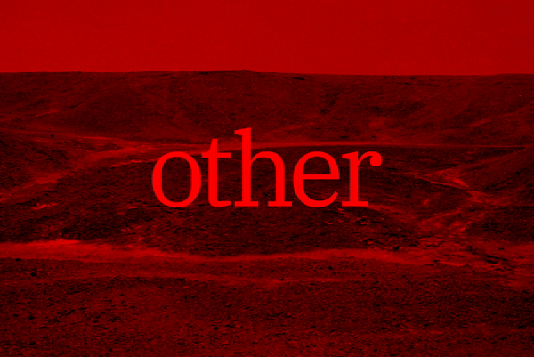
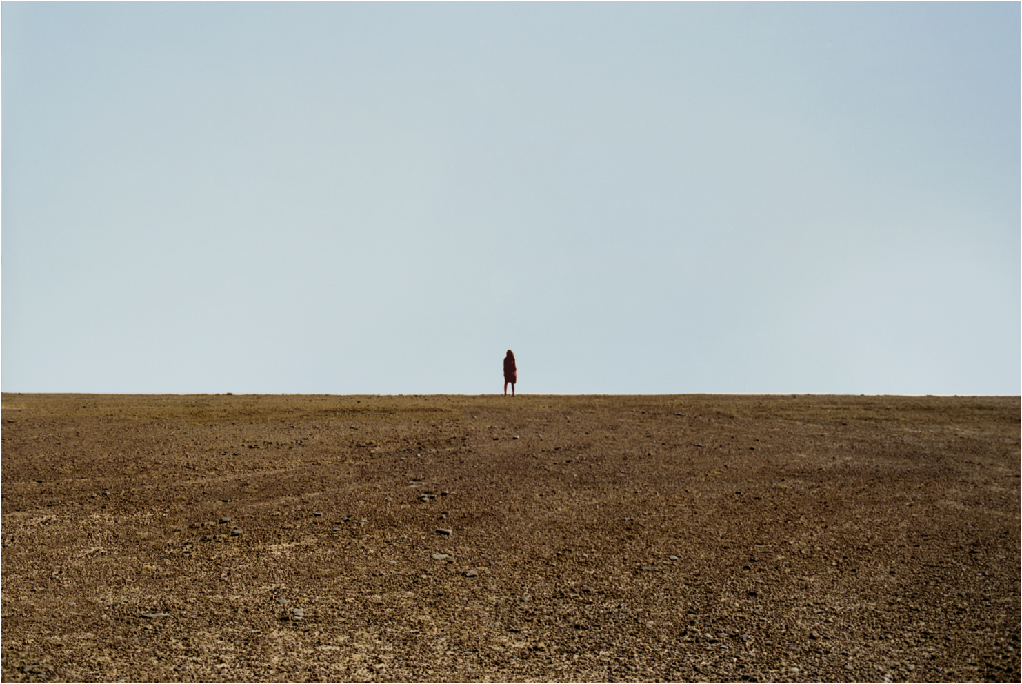
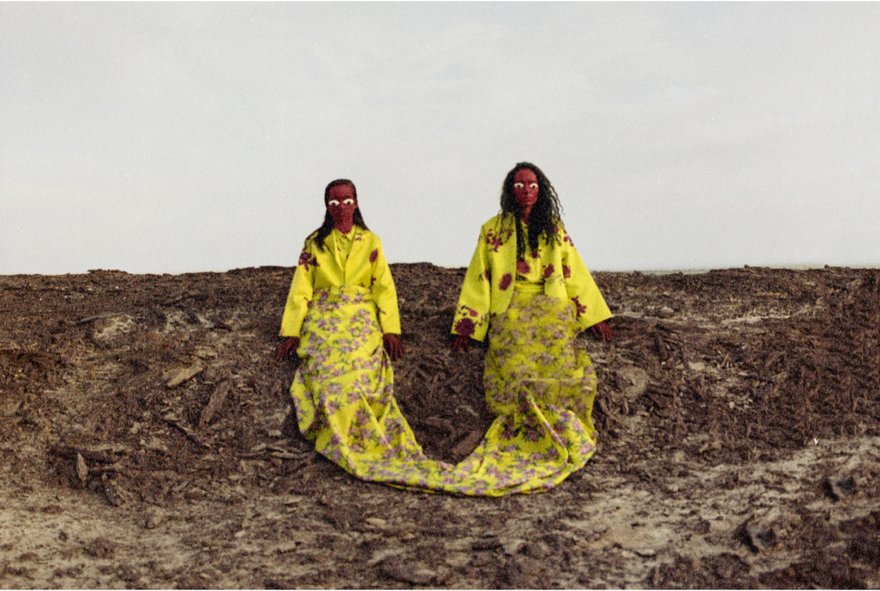
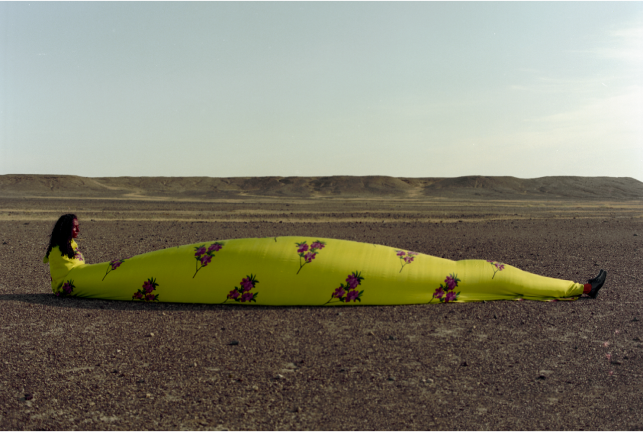
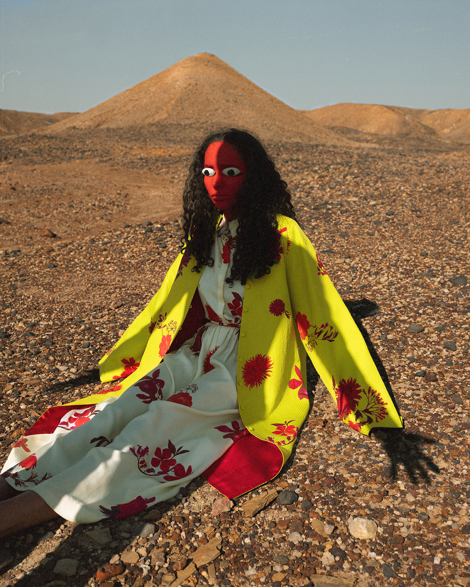
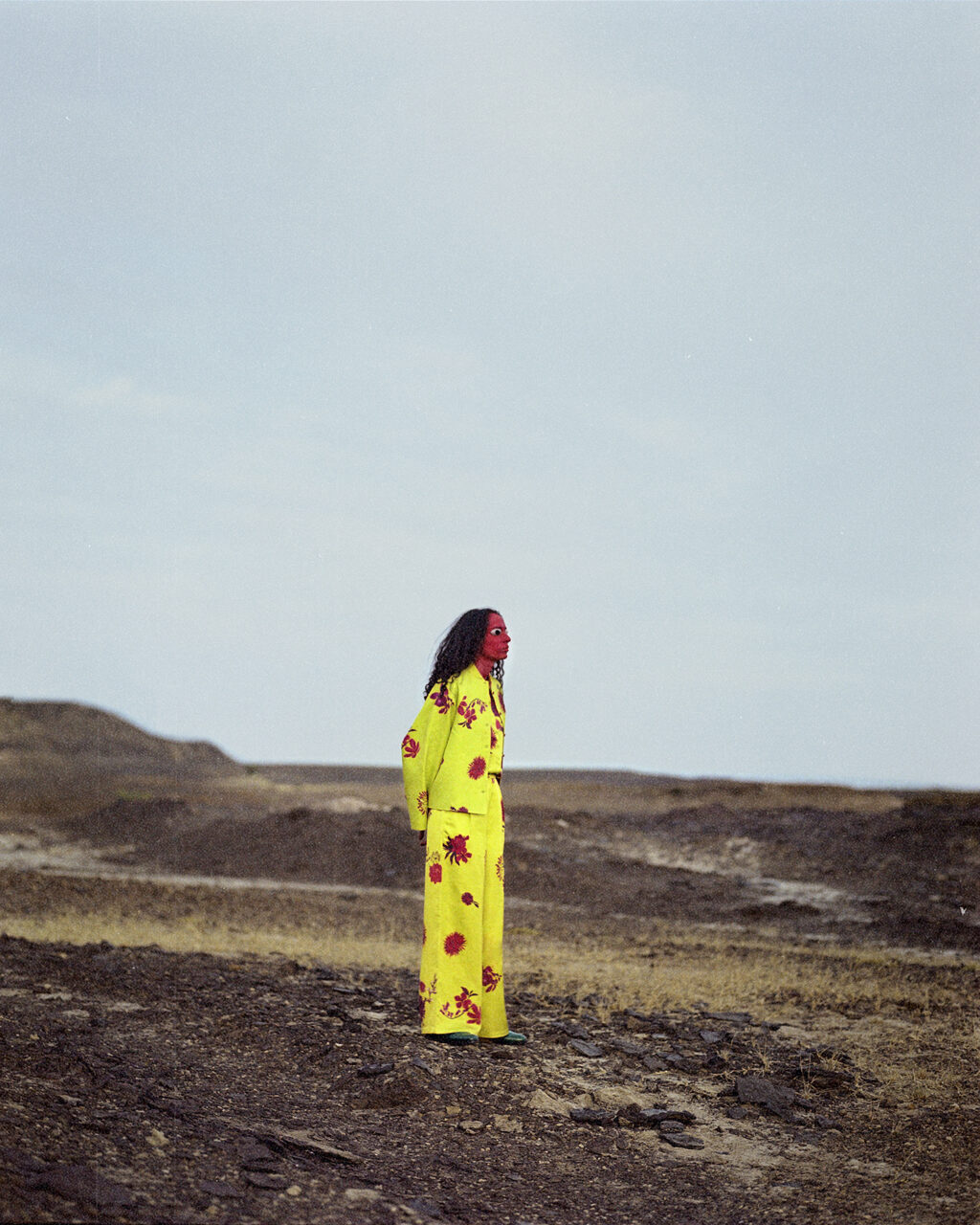
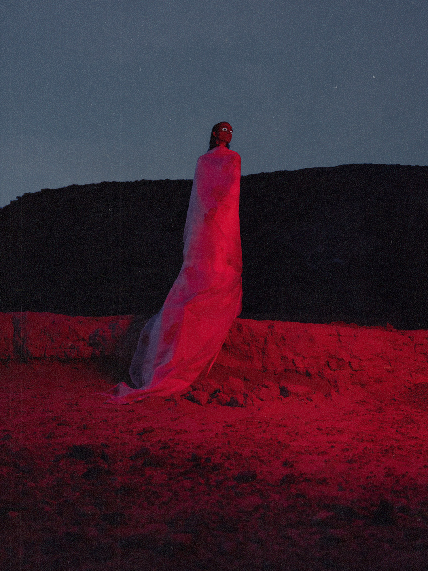
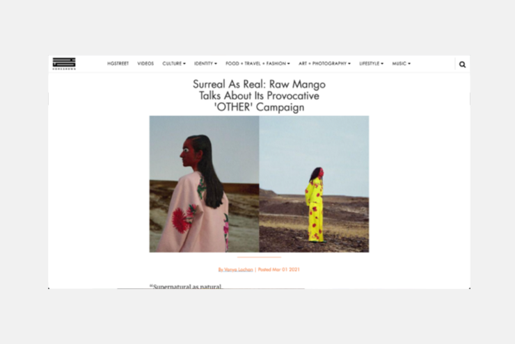
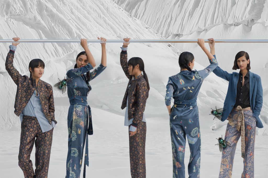
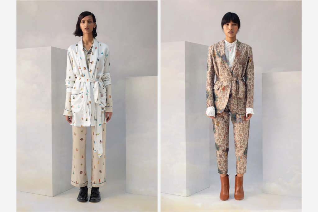
Aposematism is when animals take on visual characteristics to signal that they are venomous in an attempt to ward off predators. Bright acidic colours are a common manifestation of aposematism and became the starting point of our narrative for Other.
““The idea should cost less than 10 rupees,” Sanjay joked. Through Other, we learnt the importance of frugality; relentless editing and abstractness became our approach for the campaign.”
Founder, Sanjay Garg, challenged us to find meaning in aposematism that could live beside Raw Mango’s brand language. True to the brand, the idea needed to be simple while creating maximum impact; “the idea should cost less than 10 rupees,” Sanjay joked. Through Other, we learnt the importance of frugality; relentless editing and abstractness became our approach for the campaign.
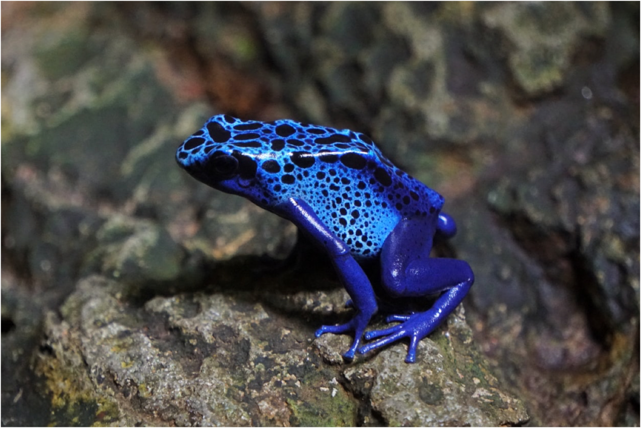
Apposematism: A poison dart frog. Image source unknown.
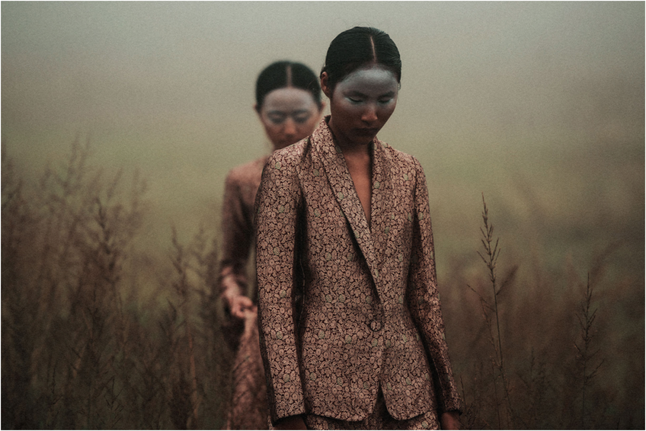
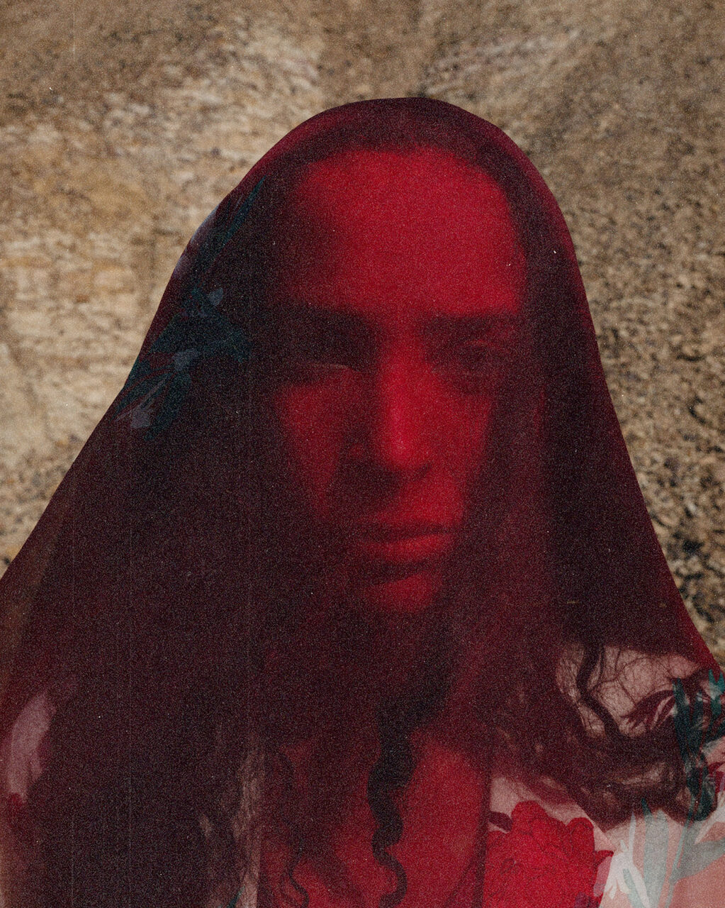
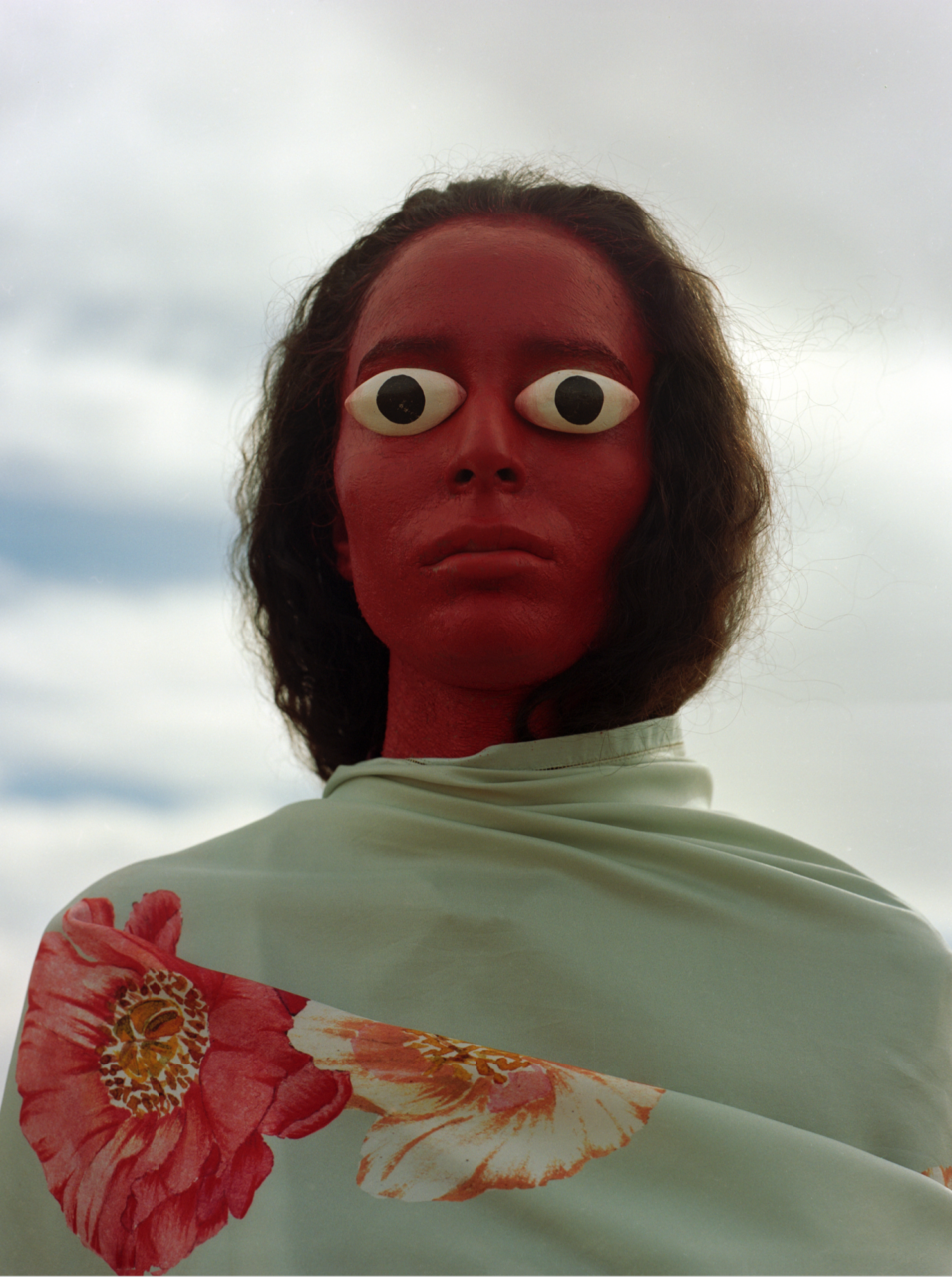
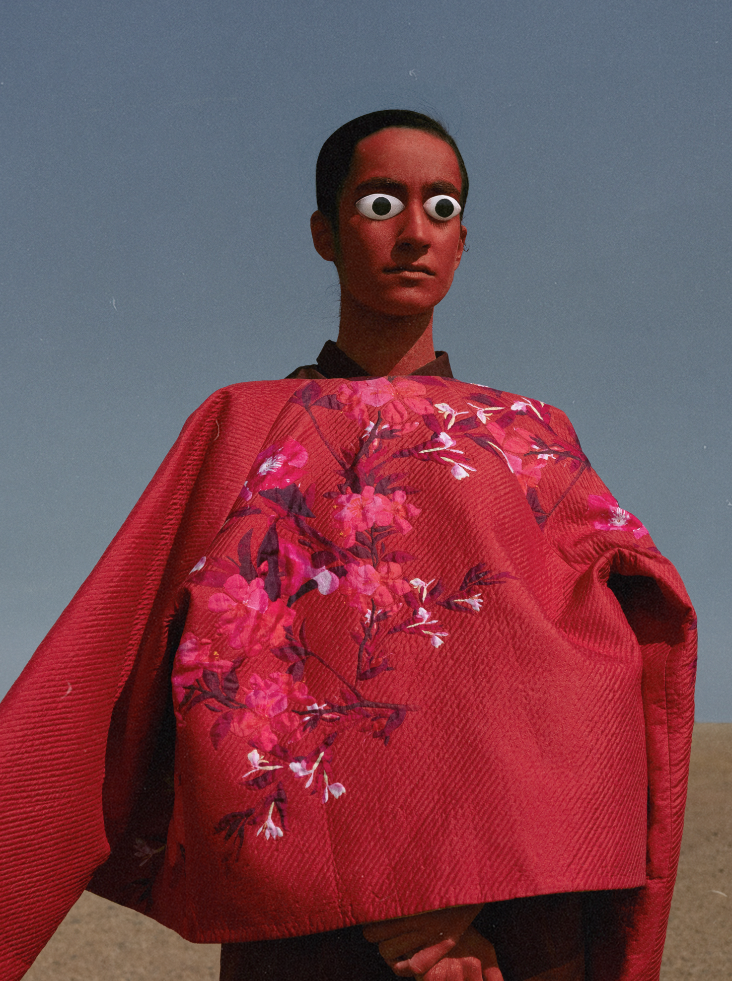
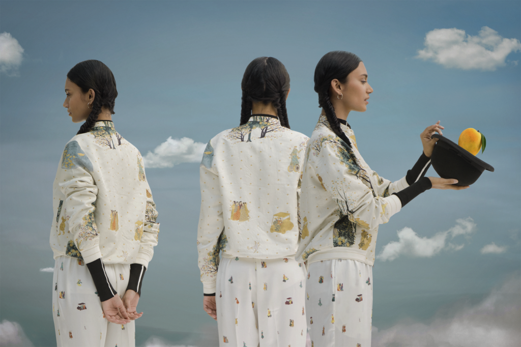
While Indian nostalgia is a prominent visual device for Raw Mango, surrealism lives as a silent pillar. The label’s first published photo was of Sanjay’s sister with her face painted in the Raw Mango’s primary colour: forest green. Another campaign, Cloud People, imagined a community of cloud-worshipers with painted faces. Iconography and symbolism are abundantly clear to the informed. Antique deity figures litter Raw Mango stores, and symbolic inspirational imagery is plentiful on its social media pages. Even the inspiration for the campaign’s ceramic eyes came from a bronze statue lying on Sanjay’s office desk.
“While Indian nostalgia is a prominent visual device for Raw Mango, surrealism lives as a silent pillar.”
Raw Mango’s Cloud People, 2017 photographed by Ashish Shah.
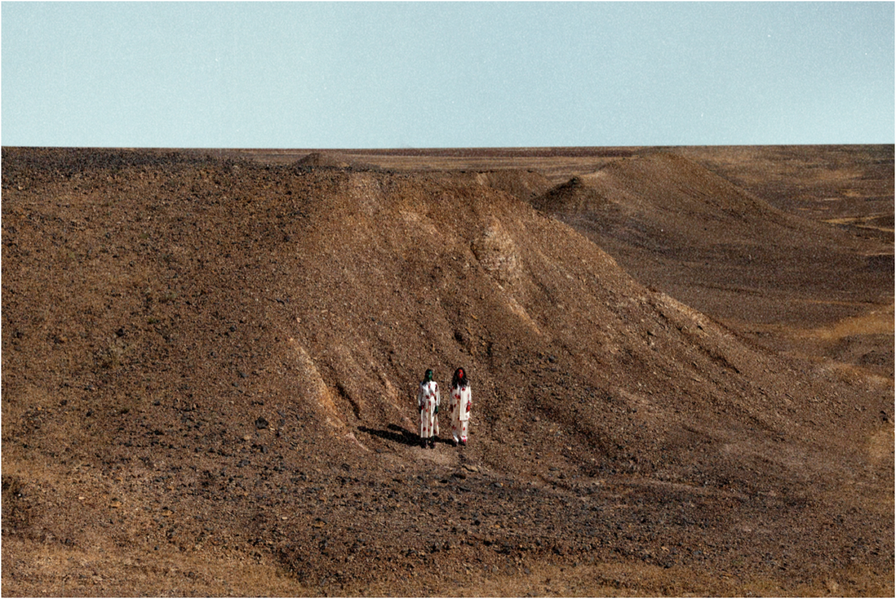
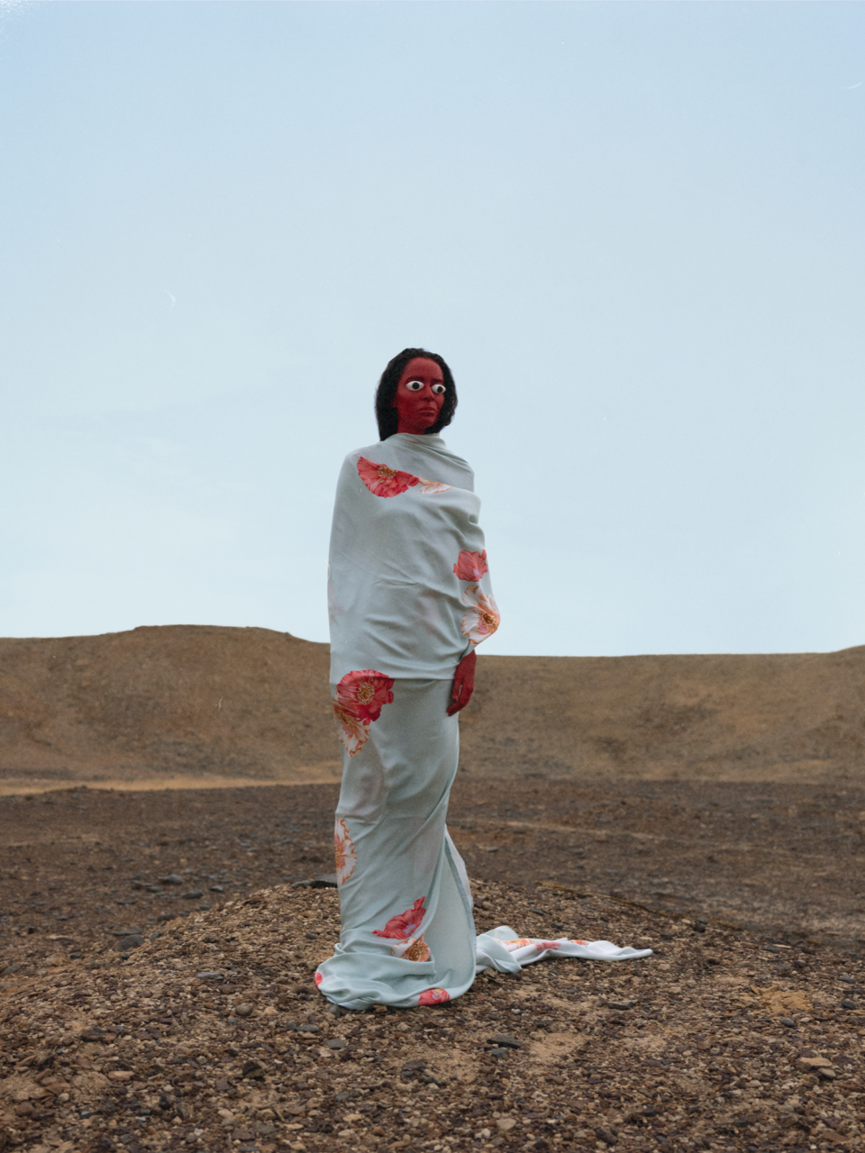
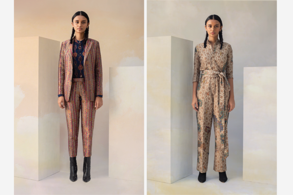
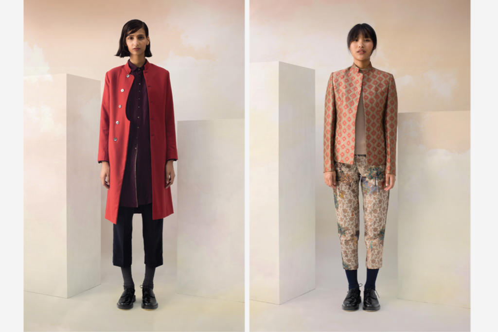
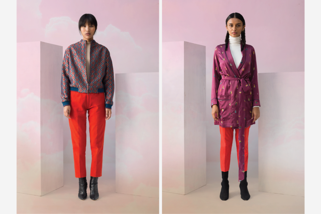
Sanjay Garg and Now Form founder Vikramaditya Sharma directed the campaign photographed by Shubham Lodha in Jaisalmer, Rajasthan. We also worked with musician Sid Vashi to create custom music for the short films shot by Vikas Maurya and edited by Akash Sharma.
Now Form created all the graphics and collateral for the campaign, including a custom animated typeface. We also designed and coded a responsive and interactive web experience that ran for the campaign’s duration. You can view the website here.
We designed a custom typeface and frame-by-frame animation for the collection title, Other.
We directed short films by Vikas Maurya and edited by Akshay Sharma. Musician Sid Vashi made custom music for the films.
We designed and developed a responsive and interactive website that ran through the duration of the campaign. Users could click and drag to experience a 3D replica of the Jaiselmer landscape while the eyes followed the user’s cursor. We also optimised the experience for mobile.
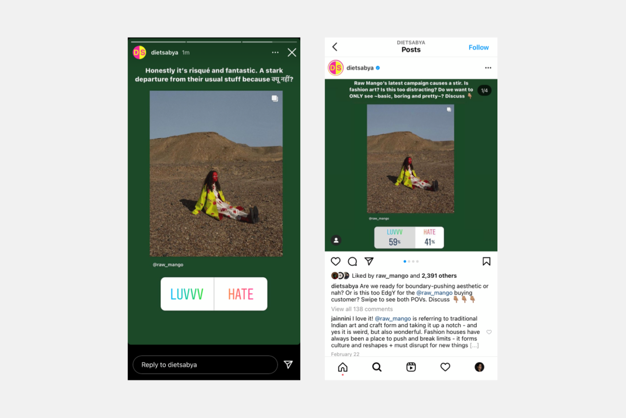
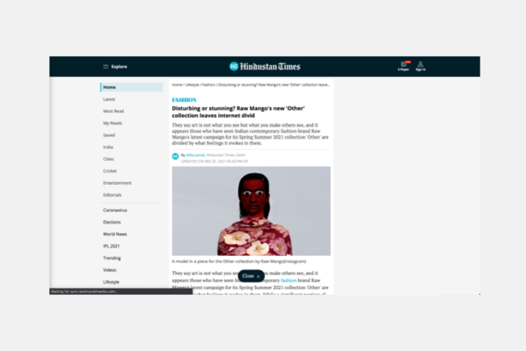
Other had a polarising effect on viewers and quickly went viral. Many viewers found the images grotesque and scary and accused Raw Mango of going too far. However, a large audience found the images pathbreaking. Istituto Marangoni, Director, Diana Marian Murek shared an Instagram story with the caption “maybe the best campaign ever”. Every major publication in India wrote about the campaign, including non-fashion publications such as The Times of India, Indian Express and the Hindustan Times.
“Istituto Marangoni, Director, Diana Marian Murek shared an Instagram story calling the campaign the best campaign ever.”
While we didn’t intend to shock our audience, we did intend to challenge a fashion campaign’s limits (in an Indian context). We achieved our goal of creating a conversation that questioned the vernacular of contemporary Indian design and fashion.
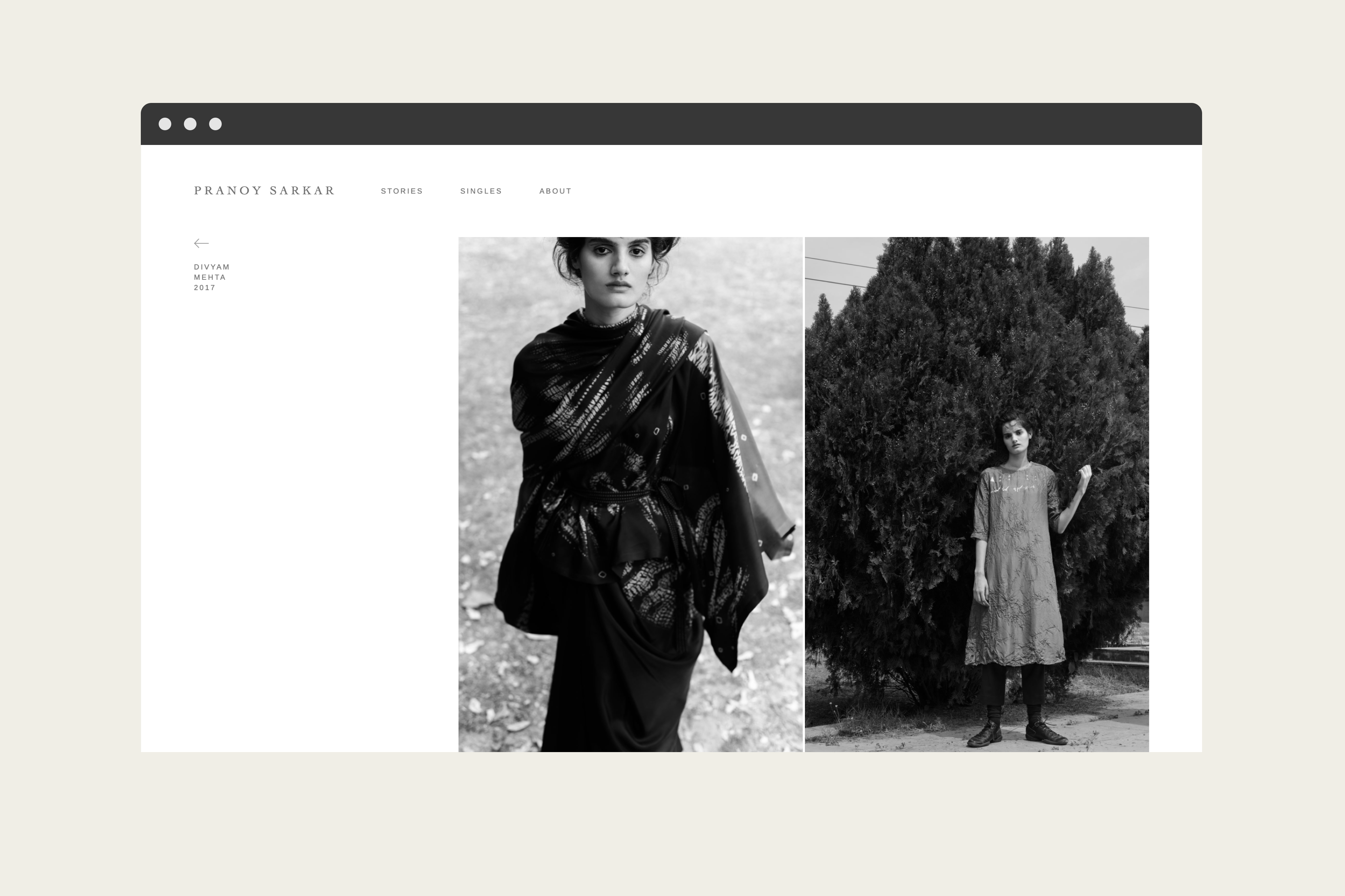
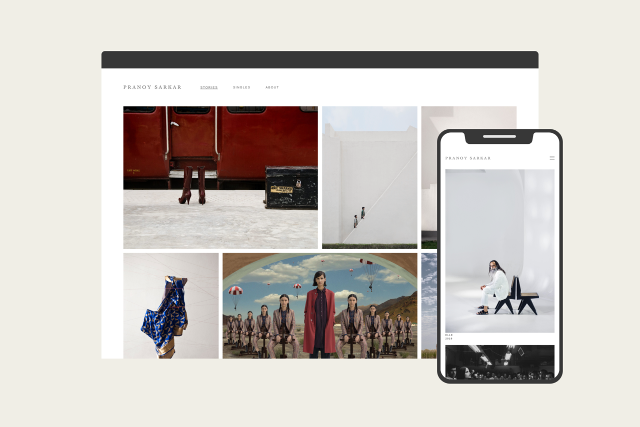
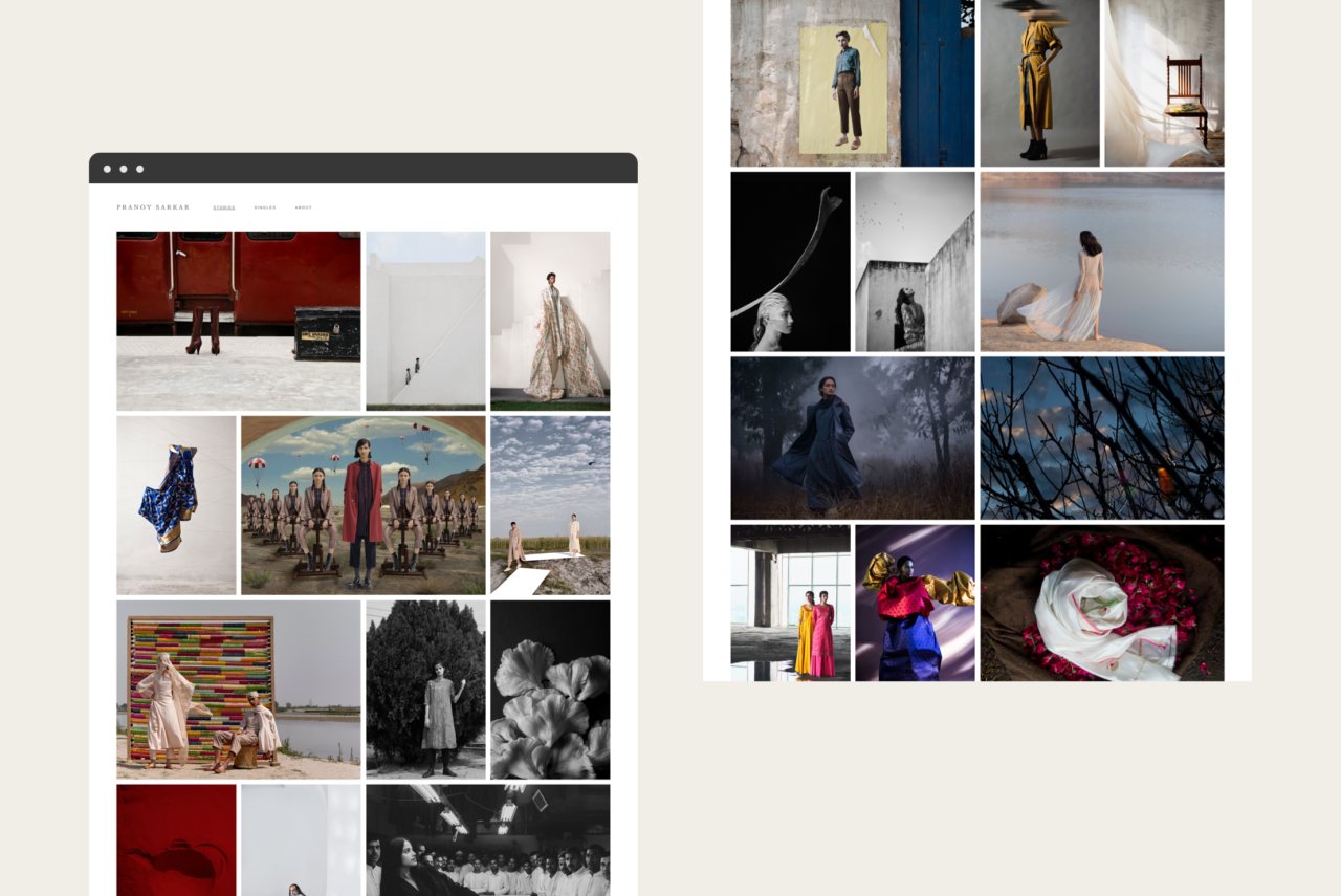
Pranoy Sarkar is a prominent Indian photographer, with an extensive fashion portfolio. His clients include Torani, Rajesh Pratap Singh, Raw Mango, Tarun Tahiliani, and Good Earth.
Pranoy approached Now Form to design his digital portfolio. We opted for an unadorned interface which showcased his work without cropping or compromising the photos.
The stories page features a seemingly straightforward grid; however, achieving a responsive asymmetric grid with virtually no cropping was a technological feat. The content management system also simplifies content upload and reorganisation of content.
candi Solar is a dedicated commercial, and industrial rooftop solar solution installer, financier, and operator geared towards SME’s, family-owned businesses, and schools across Asia and Africa. With an affordable payment model, short contract period, and easy installation/ de-installation, they leverage the vast untapped rooftop potential in these underserved sectors to free up capital for SMEs by lowering their effective power price.
Recognising that sales agents were making false promises about the product in order to make a sale, candi approached us to design a short video for their third-party channel partners and sales representatives to present to potential customers. They needed a fool-proof video that could streamline the sales process by clearly and accurately explaining the solution and its benefits to prospective clients.
“The demonstrative and visual approach of the video also avoids any potential language barriers by aiding comprehension for a predominantly semi-English speaking customer base.”
We created a short, illustrative video that combines text, animated graphs and graphics, and drone footage to clearly highlight candi Solar’s unique offerings. The demonstrative and visual approach of the video also avoids any potential language barriers by aiding comprehension for a predominantly semi-English speaking customer base. Accompanied by an explanatory voice-over, the video serves the purpose of being transparent, informative, and easy to understand.
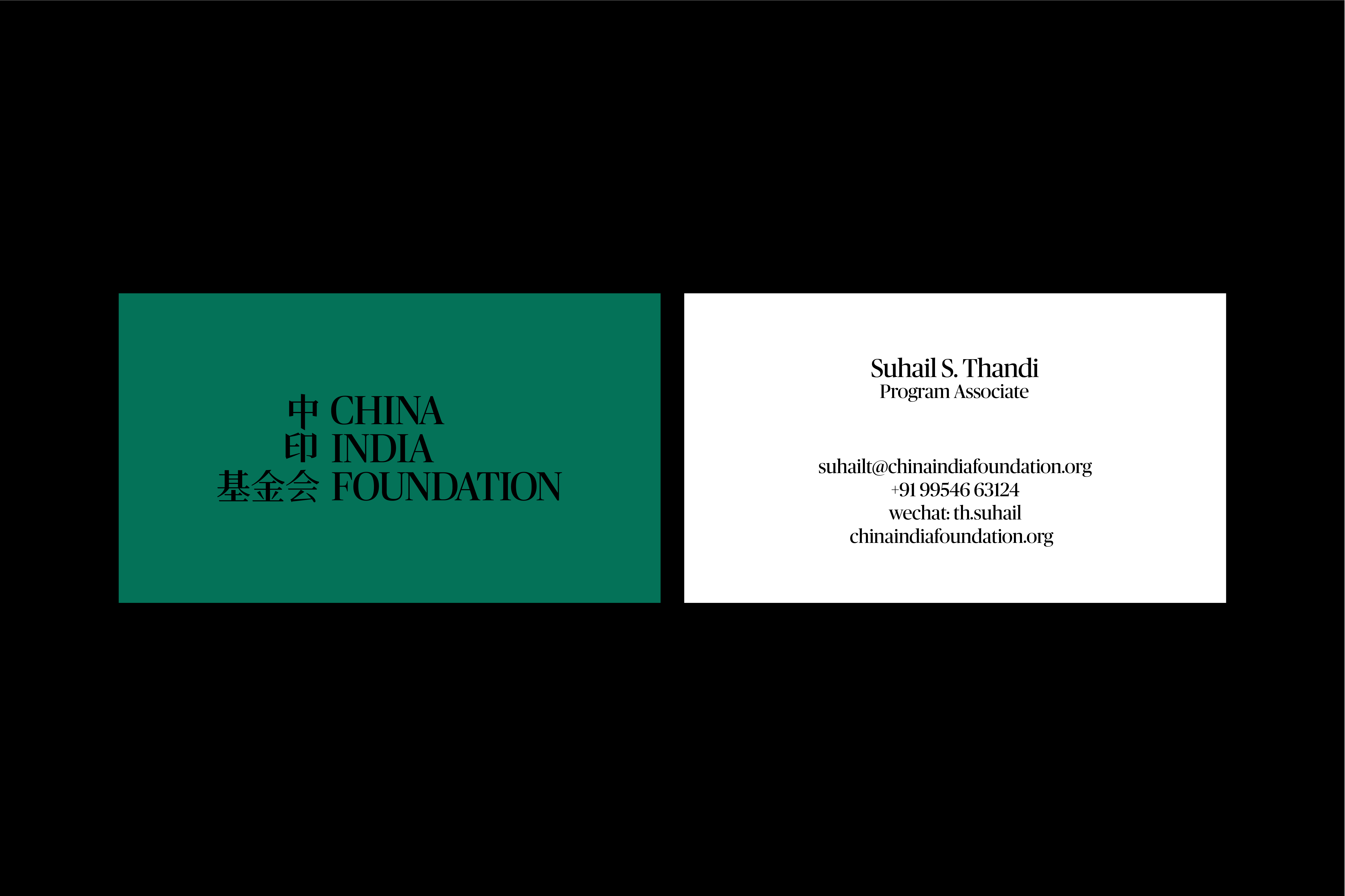
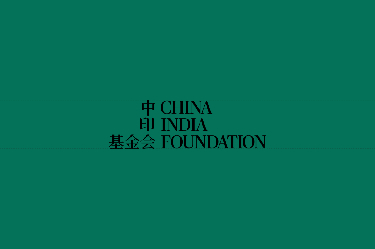
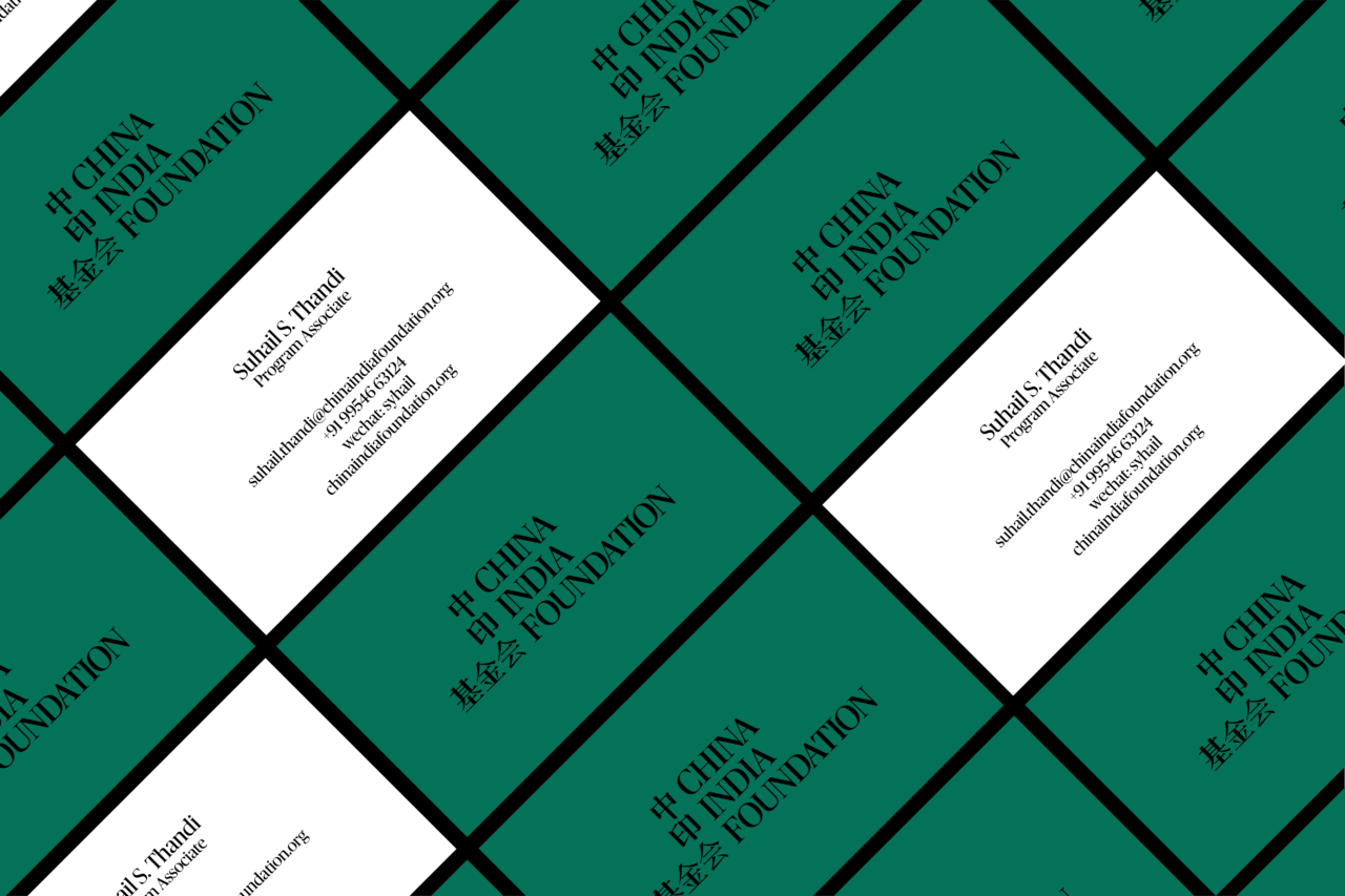
China India Foundation is a non-profit organisation with the mission to increase mutual understanding between the people of India and China by creating avenues for collaboration, building people-to-people exchange, and strengthening the capacity for cross-cultural engagement. We worked with CIF to create their brand identity and digital language.
“A type-only logo felt like the right choice for being unbiased and apolitical.”
The organisation is for students, academics, policy practitioners, and business people from India and China.
The relationship between India and China is sensitive; A type-only logo felt like the right choice for being unbiased and apolitical. Even the countries in the name are sequenced alphabetically. The variation in line weight found in traditional Asian calligraphy inspired our serif-type logo.
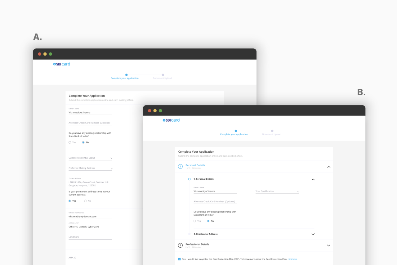
Now Form works cross-functionally with SBI Card’s Marketing, Digital, Business, and IT team to design their customer-facing website. Through primary and secondary research, including trend analysis, benchmarking, and analysis of their existing digital assets, we identify and create new strategies and interventions for their B2C and B2B flows.
In acknowledgement of our work, SBI Card also approached us to create a new visual language and experience for their website as part of a larger digital transformation. Based on our comprehensive research of digital and industry trends, we’ve redefined several journeys, including their pre-login card application, first-time user registration, and onboarding experiences.
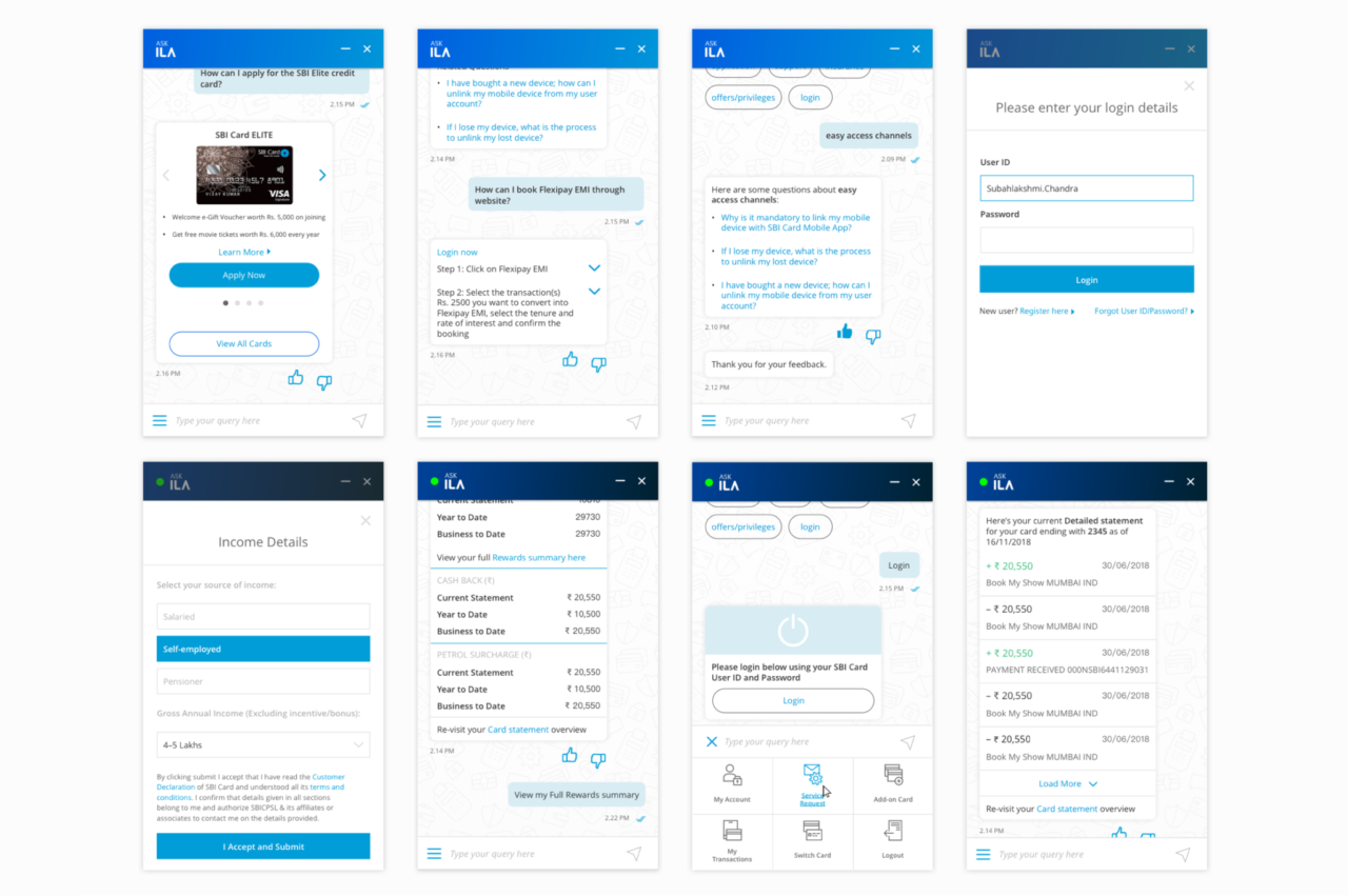
Notably, we also designed the UX and interface of their new Chatbot ILA, which is amongst the most advanced banking chatbots in India and internationally.
Our Approach
Our team uses a range of UX tools to get a comprehensive understanding of the scope and requirements of SBI Card’s digital assets and user needs. Through UX processes like competitive research, benchmarking, A/B testing, and rapid prototyping workshops, we can make informed decisions towards identifying and co-creating more resilient solutions.
A/B testing– Use case one: Segregated fields into collapsible sections to contextualise stages of the flow and reduce scrolling; Use case two: Upfront input fields under a single section feels lengthier, requiring additional scrolling.Through rapid prototyping, we collaboratively establish the experience and content structures
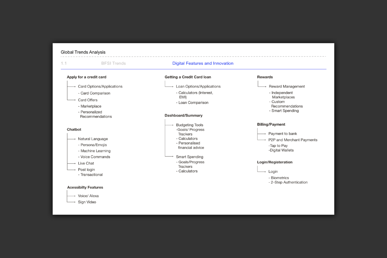
Understanding the global banking landscape
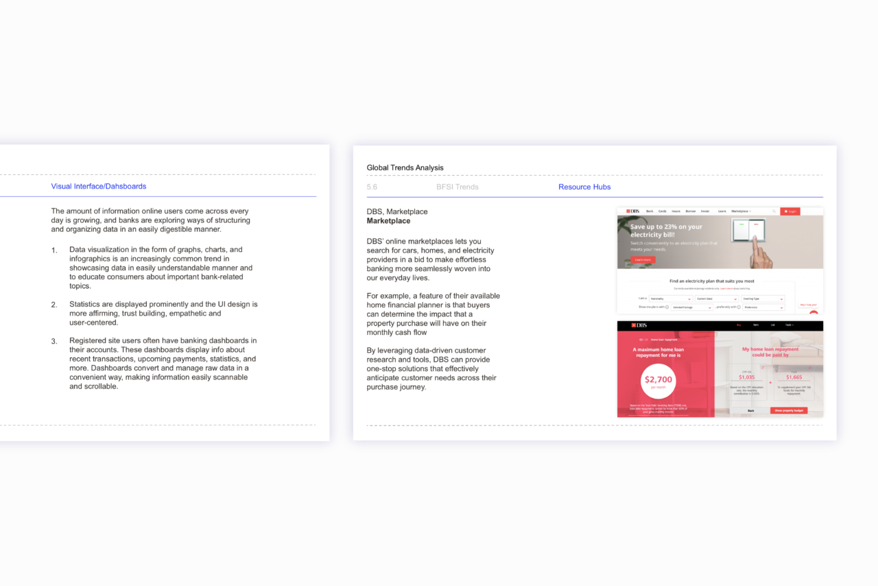
Through our research, we learned that traditional online banking services are rapidly being redefined from money management platforms to 360 social payment platforms. Using AI, they are also focusing on customising user experiences and making websites more dynamic. Additionally, recognizing the growing needs of Millennial and Gen Z populations, banks like Bank of America, Santander and DBS leverage dedicated content hubs and tools for financial advice and management to address this demographic.
As part of our research, we identified key digital innovations that have been implemented across Banking and Financial Services.
Our research continues to inform SBI Card, and our approach to new journeys on the website. Based on our documented research, we have designed several new features, including a two-factor authentication journey or a secure login experience and a more robust spend analysis tool accessible through SBI Card’s chatbot, ILA. The research has also informed our strategy behind the revamp of their UI and experience, helping identify emerging technology and global banking trends to enhance their virtual presence.
Based on our study of general UI and UX trends and digital and tech innovations in BFSI, we identified ways in which SBI Card can improve their digital touch-points.
SBI Card 2.0
Our new visual language for SBI Card abandons traditional, dated banking UI for a more clean and contemporary look and feel, displaying full-screen content and less dense layouts to keep important information in focus. The new UI also focuses on providing users with more personalised, interactive, and mobile-friendly experiences. Playful illustrations, transitions, and pared-back interfaces simplify navigation and help increase engagement.
“The use of personified guides featuring women, men, and gender-neutral characters illustrate the narrative of a user’s journey, humanise the interface, and create moments of playfulness in otherwise lengthy flows.”
The use of personified guides featuring women, men, and gender-neutral characters illustrate the narrative of a user’s journey, humanise the interface, and create moments of playfulness in otherwise lengthy flows.
As part of their ongoing transformation, we have redefined several key flows on the website:
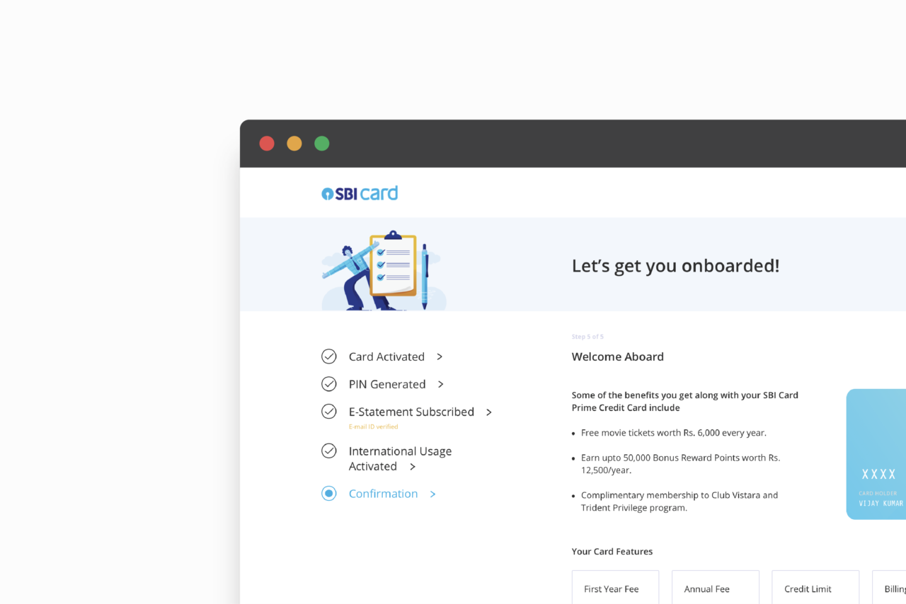
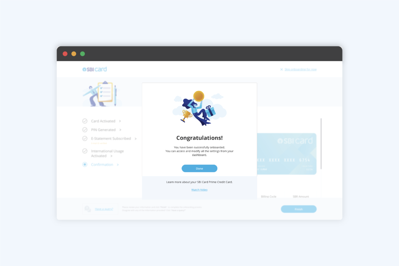
New user registration and digital onboarding: Our team redesigned the digital registration and onboarding of first-time SBI Card customers. To reduce high drop-off rates, we created a more engaging onboarding experience featuring micro-animations, dynamic visual content and progress trackers that help simplify the experience and motivate users to complete the journey.
“To reduce high drop-off rates, we created a more engaging onboarding experience featuring micro-animations, dynamic visual content, and progress trackers that help simplify the experience and motivate users to complete the journey.”
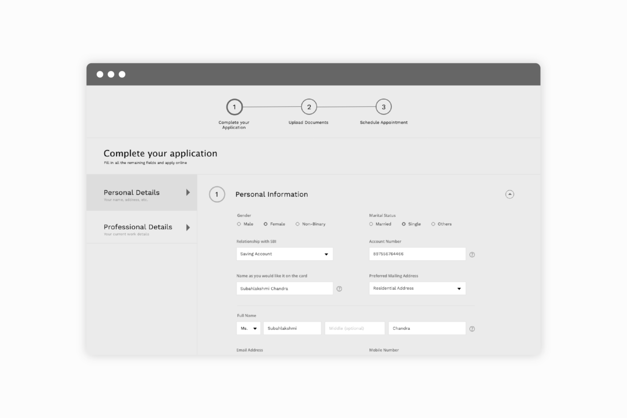
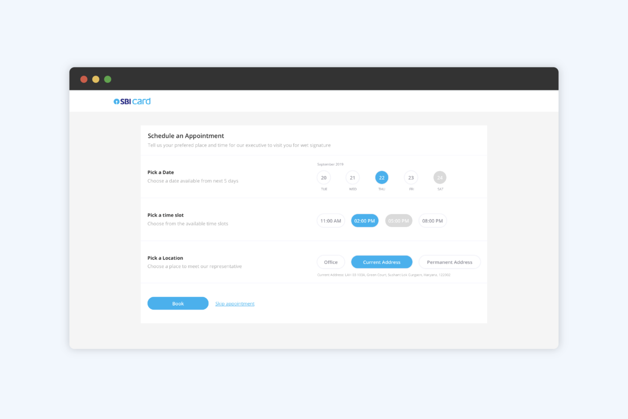
Online Card Application: Our redesigned card application form helped digitise the entire process of applying for an SBI Card credit card online. Previously, prospective customers could initiate a new card application on the website. However, to complete the process and procure any necessary documentation, an SBI Card executive had to manually reach out to customers and schedule a visit, thus breaking the journey by taking it offline.
“Our solution allows customers to complete the entire application process and upload supporting documents online, reducing human intervention and therefore, costs, as well as facilitating faster processing times.”
The customer is only required to provide a physical signature for which they can schedule an appointment online for the SBI Card’s executive to visit.
Our solution allows customers to complete the entire application process and upload supporting documents online, reducing human intervention and therefore, costs, as well as facilitating faster processing times. In case human intervention is required, a customer can easily schedule an appointment within the flow, eliminating the need to exit the application process mid-way. The redesigned form also accommodates additional benefits such as add-on cards and standardised cross-selling.
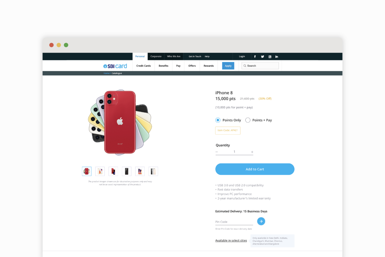
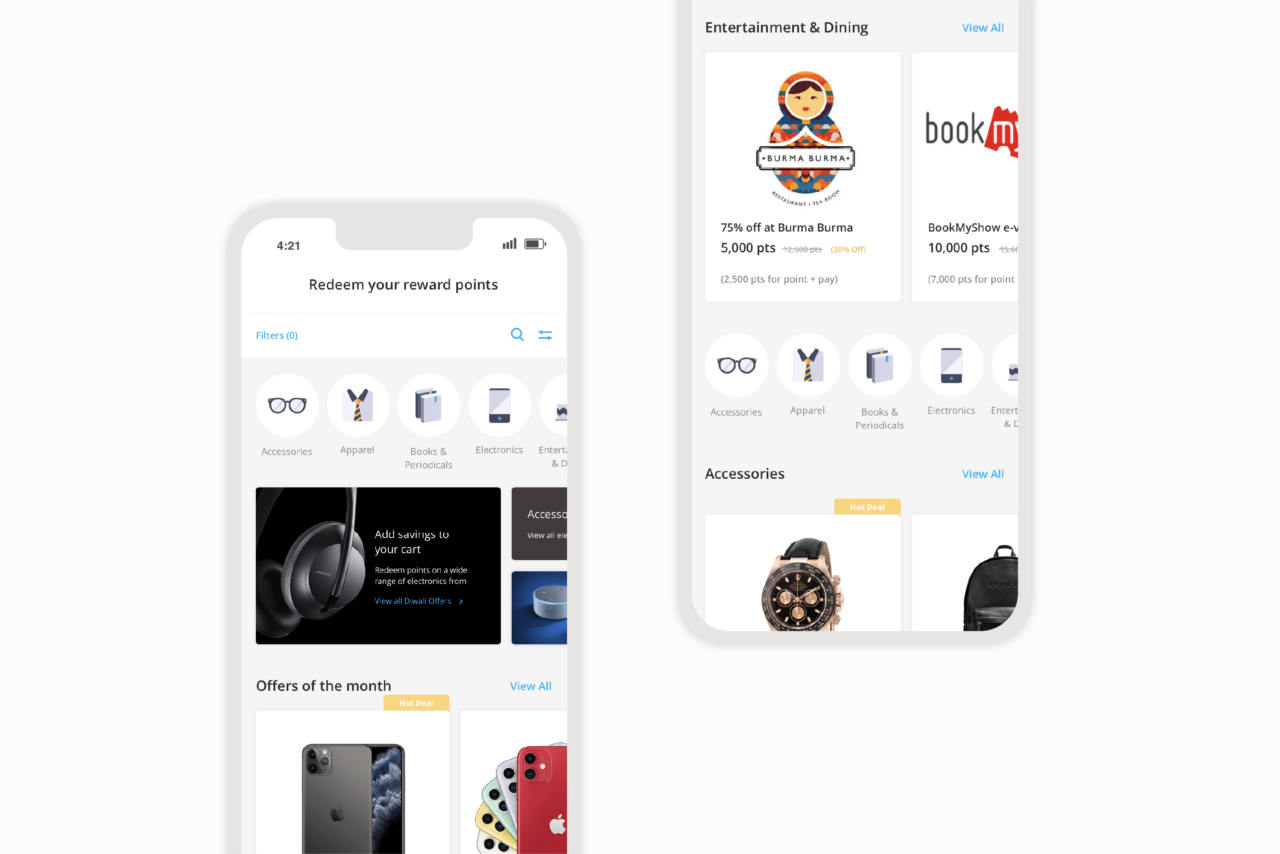
Rewards: We redesigned SBI Card’s rewards experience; The previous interface deviated from a standard e-commerce experience making it difficult for users to seamlessly spend and purchase. Our solution, designed with the end-user in mind, is more buying-focused. The new interface includes intuitive shop-friendly filters, a seamless mini cart, add-to-cart functionality, and a structured interior product and voucher page that clearly communicates relevant features, information, and supports video content to better showcase products.
“Our solution, designed with the end-user in mind, is more buying-focused.”
Clickable categories are positioned at the top of the page for quick and easy filtration, and a scrollable grid of promotional banners highlights featured offers for users to quickly explore and save. The new journey makes it easier for customers to search, set goals, and redeem rewards with available payment and redemption options, displayed up front.
Designing B2B and B2C journeys for the existing website:
Now Form works on customer flows and B2B portals for SBI Card’s existing website. We work on the tonality, architecture, and implementation of digital strategies and interventions based on our research of industry trends, as well as on focused benchmarking for the functionalities we tackle.
We work on customer-facing interfaces ranging across various stages of an SBI Card user’s online banking experience. Some of the flows we have designed include:
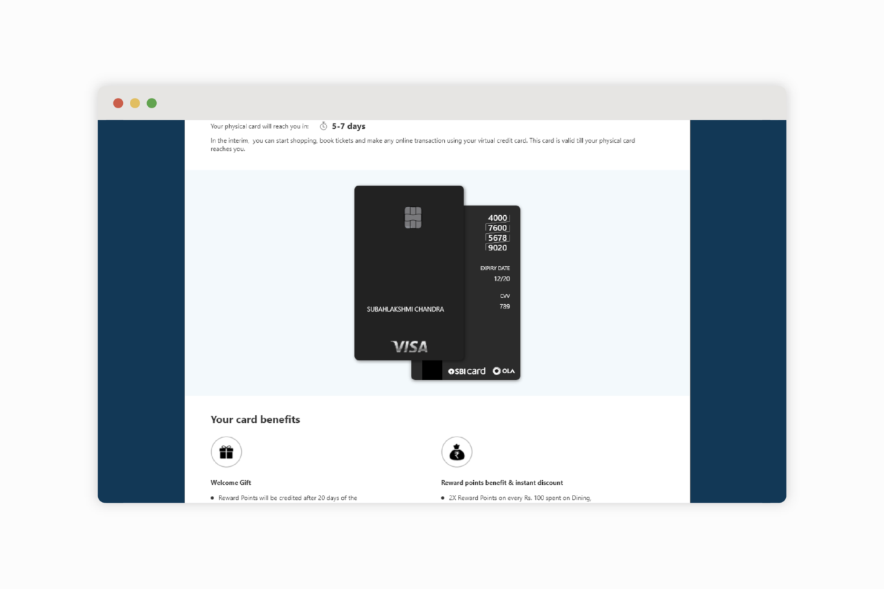
Virtual Card: SBI Card’s virtual credit card or “Insta-card” is an intermediary digital card that allows new cardholders to make transactions, view card details, and get an overview of available features before they receive their physical card. We designed the overall experience and content architecture, including digital representations of their horizontal and vertical cards.
Insta-card, an intermediary digital card, allows new card-holders to instantly make transactions and view their card details and features even before receiving a physical card.
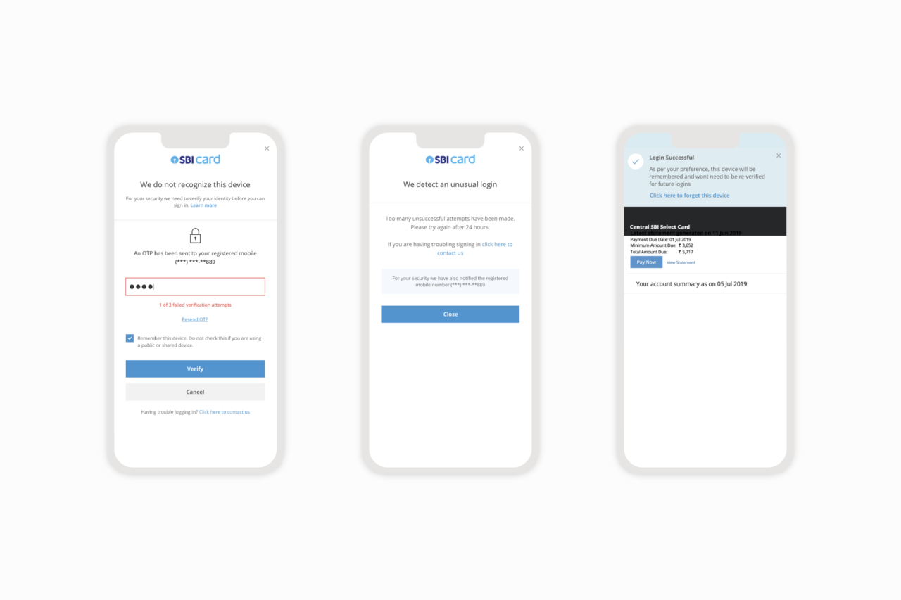
Two Factor Authentication: Although transactions are made secure through an OTP, other sensitive financial information remains accessible through a simple (less secure) login. Our two-factor authentication design, which includes intuitively placed smart options, made the overall banking experience more secure for users.
Our two-factor authentication design made the overall banking experience more secure. We made the experience more dynamic by including intuitive smart options.
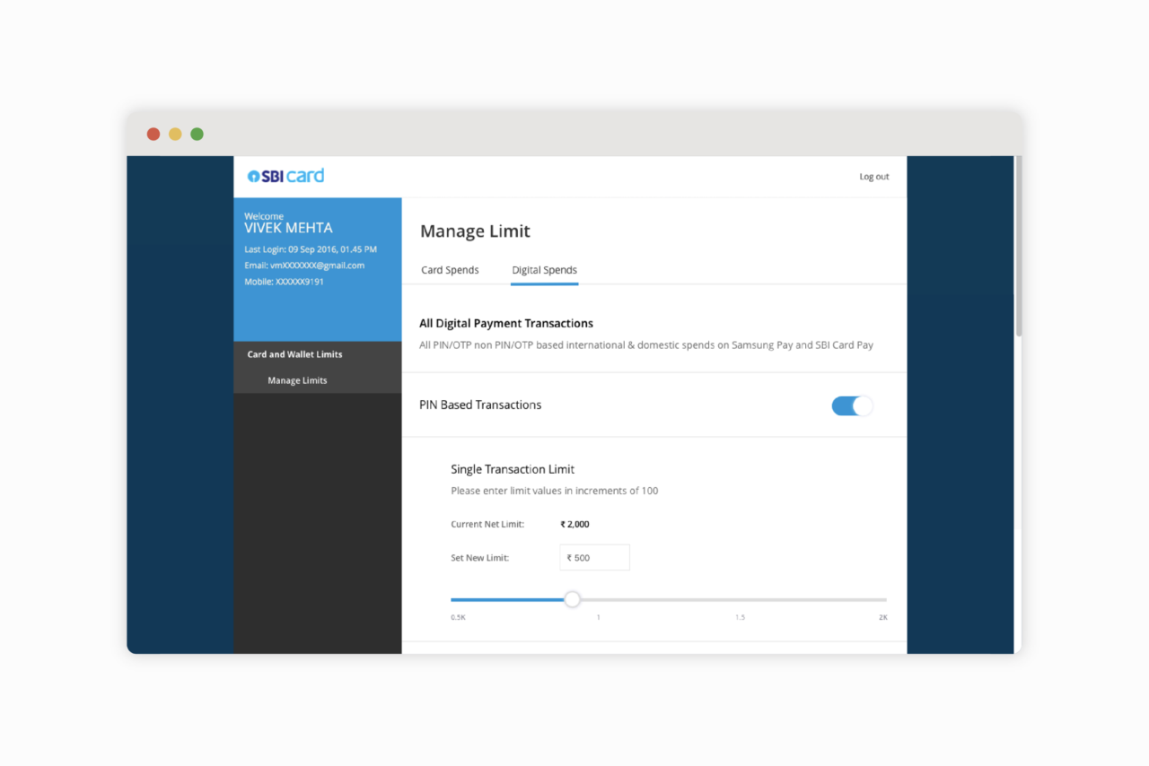
Card and wallet limits: We designed a journey to allow users to manage their Card and Digital Wallet spend limits online. Through this, users can see an overview (dashboard) of their limits, as well as modify and manage individual limits. Our solution mainly comprises toggles and sliders to help users visualise and edit limits with ease.
Our solution for setting Card and Wallet limits comprises mainly of toggles and sliders to help users visualize and modify the values with ease.
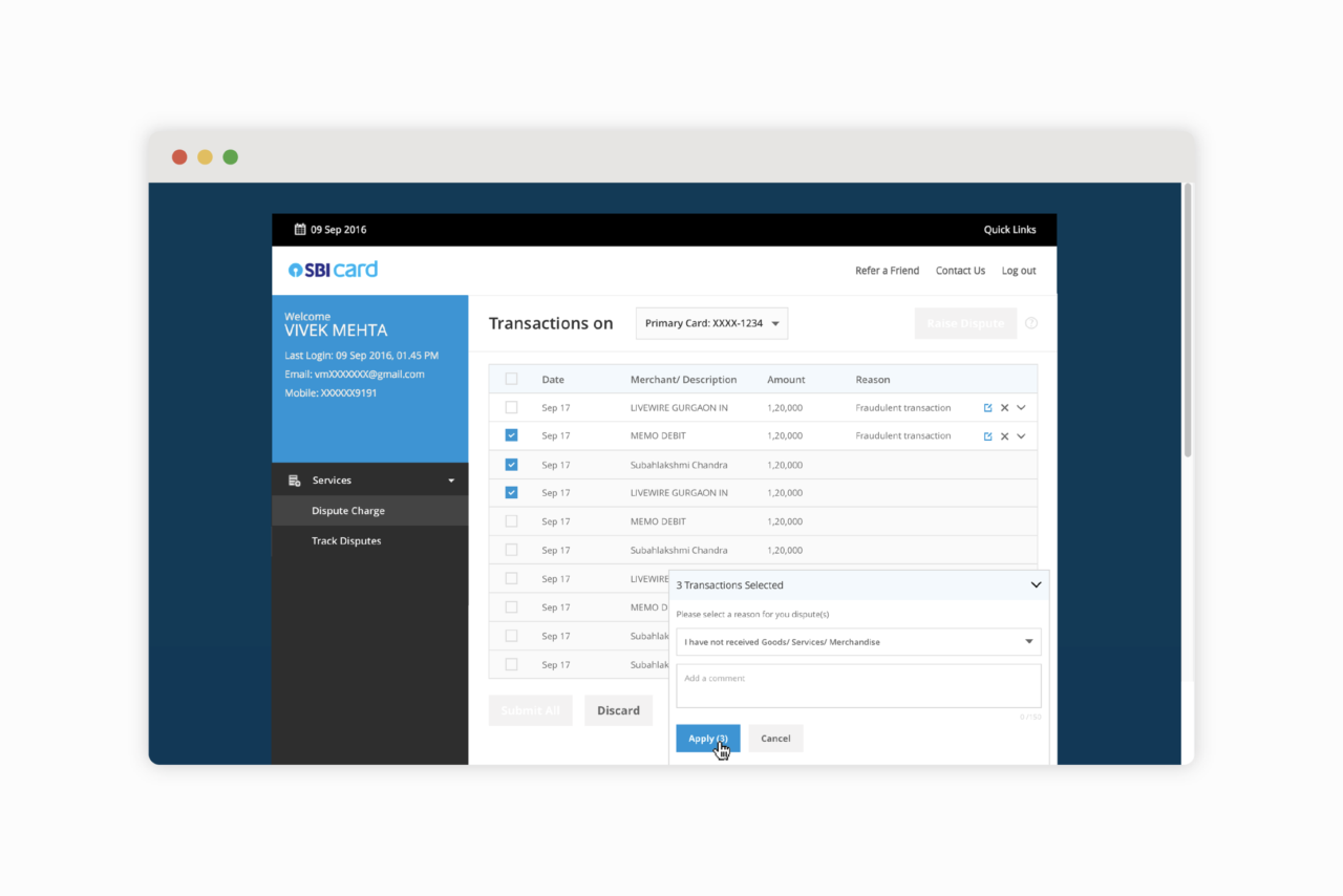
Online dispute management for fraudulent charges: Our online Dispute Management solution streamlines the process of raising disputes on fraudulent charges. Before this, the experience was primarily offline and tedious. Our solution helps users raise multiple disputes quickly and with ease and track real-time progress on a timeline.
We also work on SBI Card’s external B2B flows and portals, for businesses to manage their financial transactions and communications with vendors. Some of the B2B journeys we have designed for SBI Card are:
By digitising SBI Card’s dispute management journey, we helped streamline the process. Our solution helps users raise multiple disputes quickly and with ease and track real-time progress on a timeline.
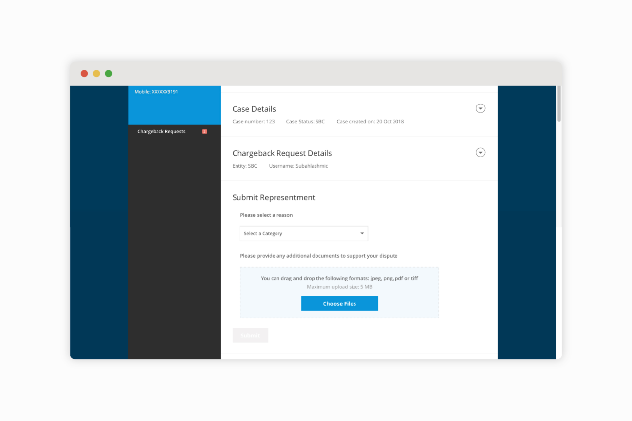
OnUS, a B2B online dispute management portal: OnUS is a B2B portal that enables the card issuer, SBI Card, to file a dispute directly to the merchant and overturn a fraudulent or accidental transaction on the cardholder’s behalf. Our solution helps facilitate simple back and forth interaction, providing a chronological history of the communication and the supporting documentation shared between SBI Card and the merchant.
A merchant can enter into the process of representment simply by raising dispute online and providing supporting documents.
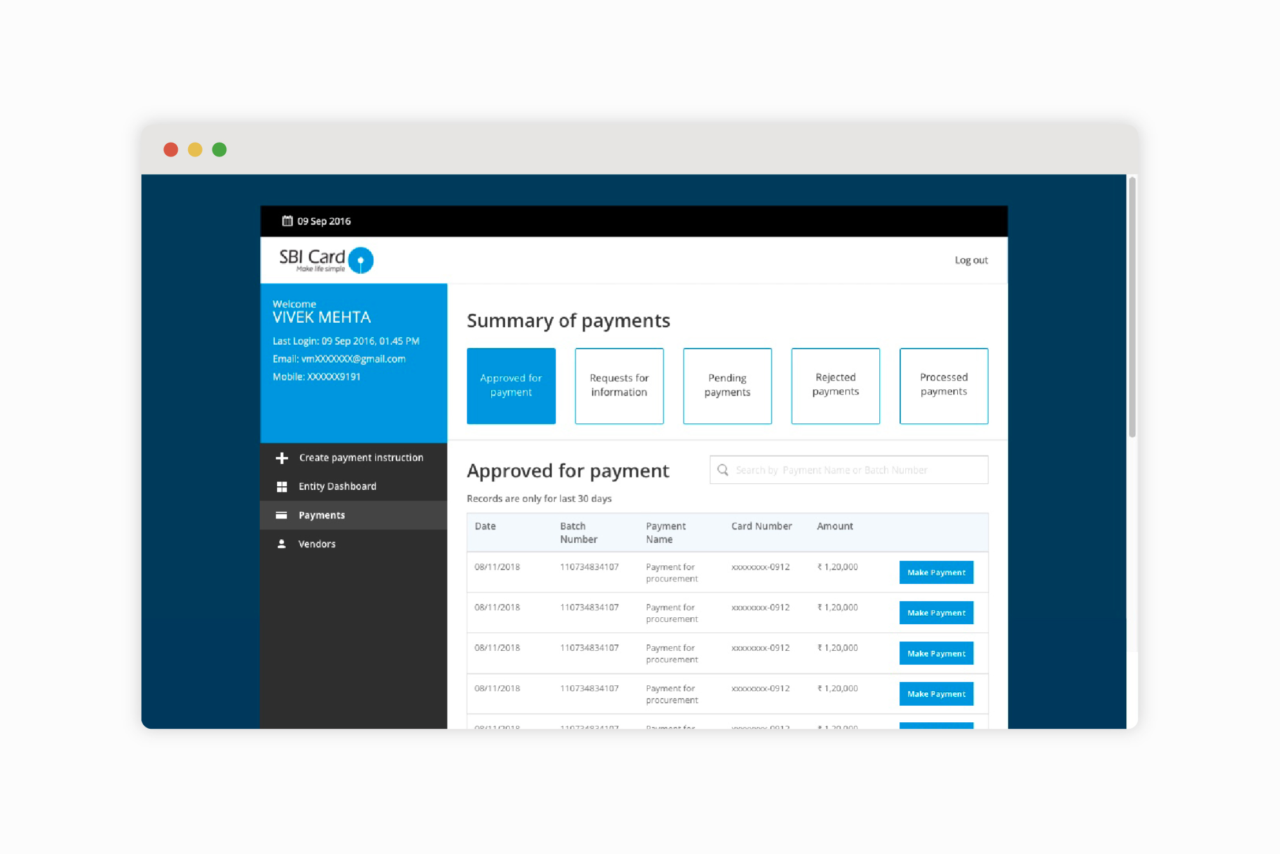
D2i, a payment processing portal for businesses: Designed to cater to three distinct users, the D2i portal streamlines the processes of creating and managing payment instructions for multiple vendors online. We worked closely with the SBI Card marketing and tech teams to identify the steps for each user through rapid prototyping. Our solution allows businesses to systematically execute the entire journey directly through the portal, including adding vendors, creating and editing payment instructions, and accommodating multiple levels of validation and approvals on these instructions, making the process more seamless.
The list of all the payments is shown in a tabular format that is categorised into sections providing ease of access to the required set of data.
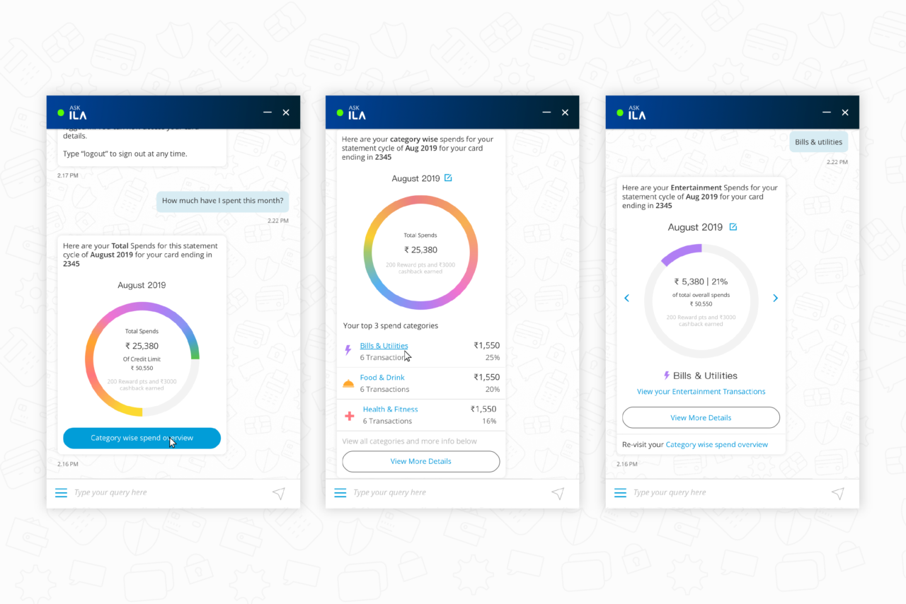
ILA, a transactional AI-powered banking chatbot
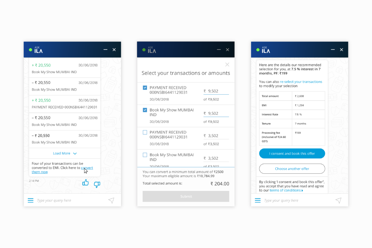
Now Form designed SBI Card’s new Chatbot, ILA. ILA’s goal is to give users access to pre-login and post-login assistance on their SBI Card account information and financial tasks. It is amongst the most advanced chatbots of any banking website as, unlike other chatbots, it is capable of handling transactional commands and complex post-login functionalities within the chat window. Using natural language, users can access advanced features including EMI conversions, balance transfer options, raising and tracking service requests, applying for a new card, and blocking and reissuing a lost or stolen card, among other account management options.
Our interface structure for ILA drew on familiar, conversational paradigms and queues; We included timestamps, feedback icons, and “typing” loaders to provide contextual indicators.
“Using natural language, users can access advanced features including EMI conversions, balance transfer options, raising and tracking service requests, applying for a new card, and blocking and reissuing a lost or stolen card, among other account management options.”
Our role involved shaping the overall visual language and pattern library for ILA. We adopted a contemporary UI approach with a simple interface, micro-interactions, customised iconography, and linear, frictionless flows.
Through benchmarking (secondary research), we reviewed chatbots and financial websites to gain a better understanding of the existing landscape and identify best practices and patterns for conversational interfaces. We also created high-level flow charts to help define basic conversational modules, message types, and conditional logic.
Designing a conversational interface: We designed the interface and patterns for ILA, drawing on familiar visual paradigms and conversational queues. For instance, we included timestamps, feedback icons, and “typing” loaders to provide familiar contextual indicators to users. We also implemented response buttons, in-text links, and a menu of primary actions to ease navigation and afford simple and straightforward actions.
We created UI provisions to efficiently convey a variety of content types (such as video, image, illustration).A short welcome message, clear CTAs and quick-links, and a menu of primary-actions help to set expectations, ease navigation, and afford simple and straightforward actions.We made the live-chat experience easily discernible for users through transitions, modified inputs, and the inclusion of an avatar and agent name on the timestamp.Patterns such as expandable points breaks-up long, text-only responses into parsable chunks to avoid overwhelming users with lengthy text.
Our team at Now Form has taken new and varied approaches to redesign SBI Card’s existing web journeys for a chat interface. For example, in place of tabular account summaries, we used descriptive phrases placed contextually beside account details to maintain a consistent, conversational tone and allow users to parse through information in a readable flow. For complex actions such as EMI conversions and balance transfer options, overlays within the chat window help keep the conversation focused, remove distractions, and avoid drop-offs on lengthy flows. We also designed the experience for a Live Agent Chat within ILA. The use of seamless transitions, a modified input field, and the inclusion of an avatar and agent name on the timestamp help make the two experiences easily discernible for users.
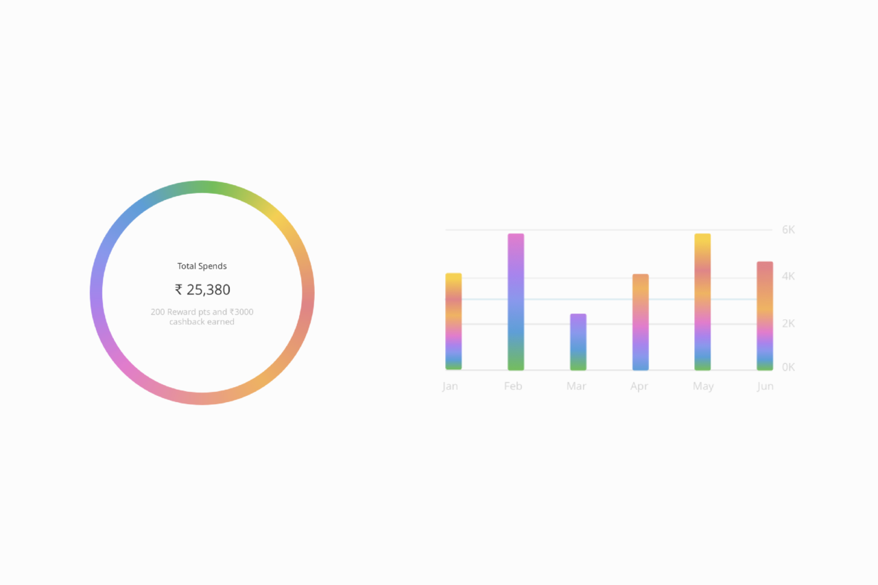
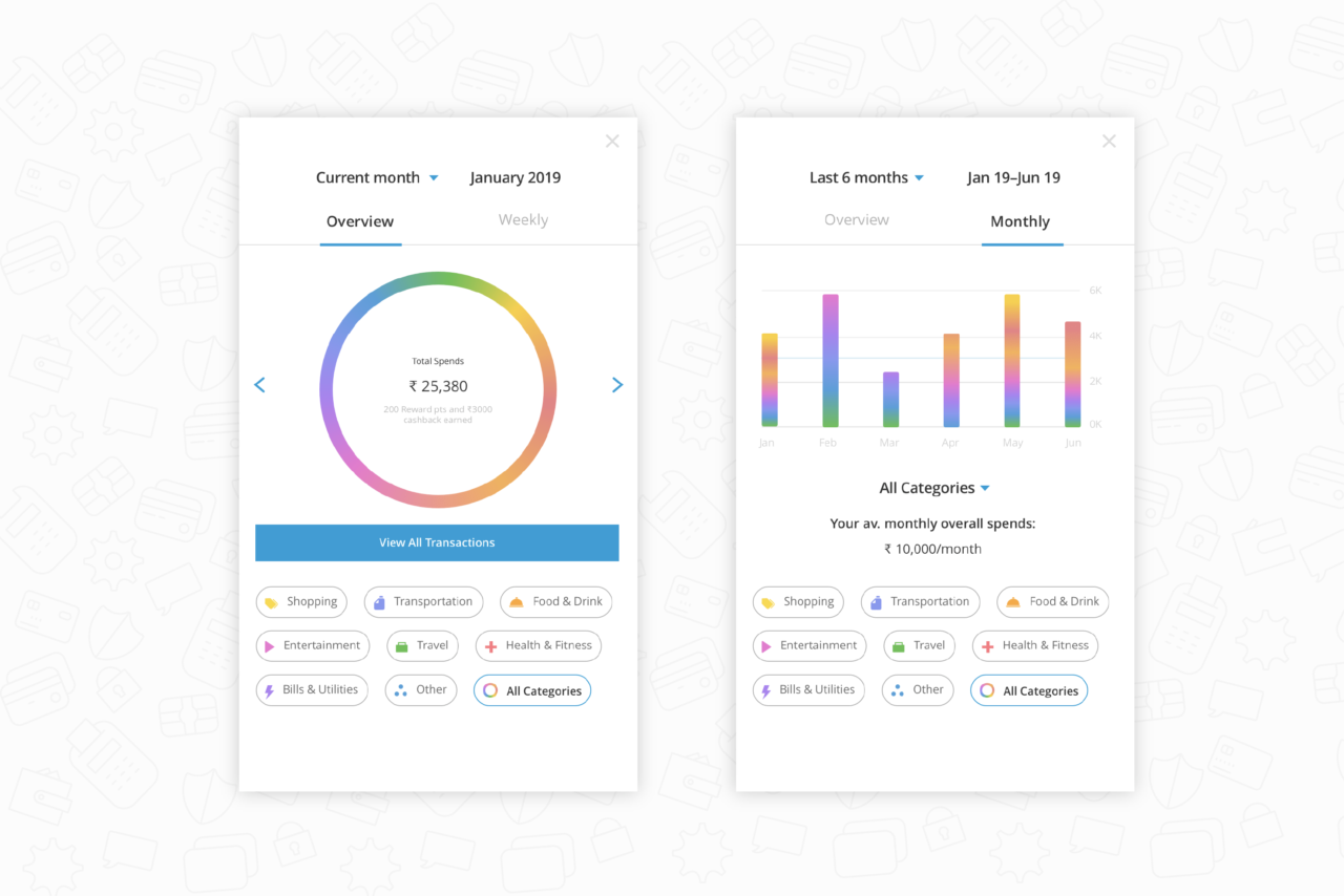
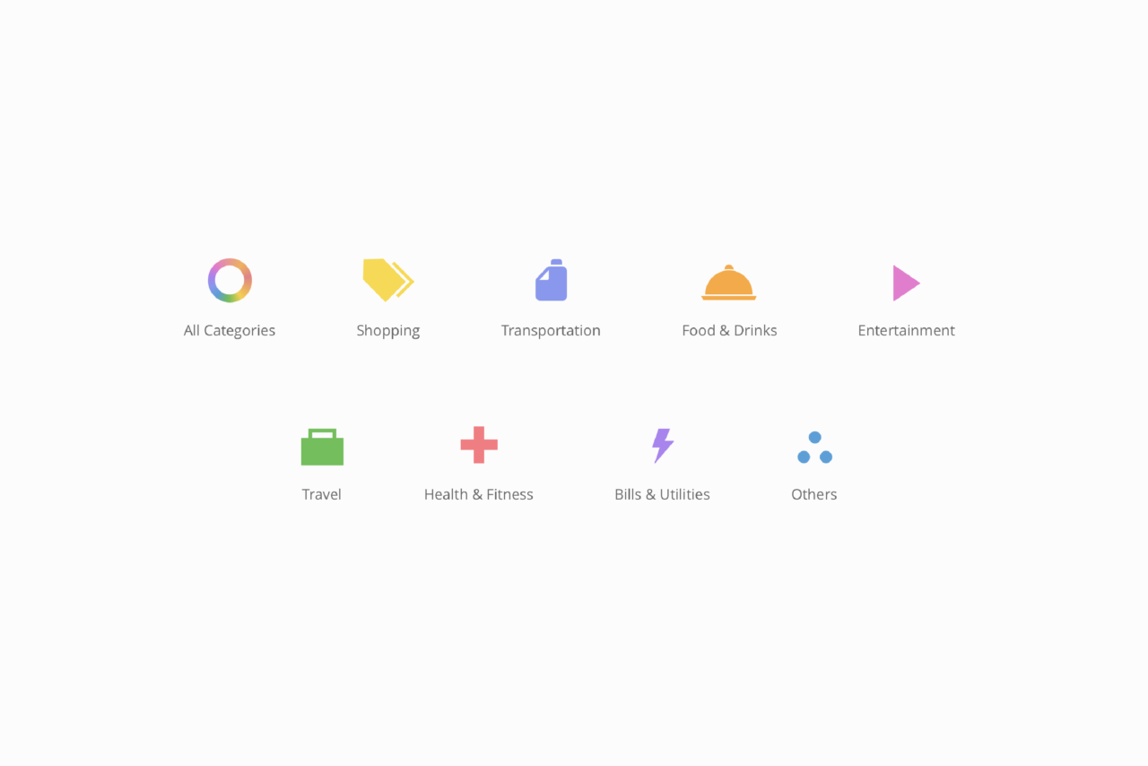
Spend Analysis: SBI Card approached us to design a more robust spend analysis tool accessible through the chatbot. Our solution helps users easily manage and track when and where they’ve spent their money. Through machine learning and AI, the interface automatically organises a user’s credit card transactions into colour-coded categories like Travel, Health, Utility, Electronics, Entertainment, and more, accompanied by distinct icons for each. Quick summaries are accessible within the conversation itself while more complex data takes users into an overlay-view, with information neatly organised into filtered tabs for easy access and comparison. Daily, weekly and monthly overviews and category-wise spend breakups, dynamic graphs, and clear, conversational labels allow users to visualise their spending habits easily.
Our solution helps users easily visualise and track when and where they’ve spent their money.
Quick summaries are accessible within the conversation itself while more complex data takes users into an overlay-viewThrough machine learning and AI, the interface organises a user’s credit card transactions into colour-coded categories accompanied by icons for each
“Since its launch, SBI Card has been able to replace their first-line customer support with ILA, addressing over 23 million queries and receiving over 25 thousand service requests booked using ILA.”
Business impact: Since its launch, SBI Card has been able to replace their first-line customer support with ILA, addressing over 23 million queries and receiving over 25 thousand service requests booked using ILA. The integration of ILA with the SBI Card app has also seen a 7x increase in average daily users and 8x increase in average daily questions asked by users. Adoption of the conversational AI solution has helped SBI Card acquire over 130 thousand leads, resulting in revenue growth of thousands of dollars.
We created a research document for the Marriott marketing team. The report consisted of ways for them to leverage industry-agnostic technology innovations (such as chatbots and augmented reality). It also covered an overview of hospitality trends as a way to improve Marriott’s digital assets.
“By changing the technology and introducing social workflows, they (Marriott) could make their assets more dynamic, improving user engagement.”
Through our research, we learnt that the underlying tech framework used by Marriott made it difficult for their hotels to upload and personalise content, resulting in a static website. By changing the technology and introducing social workflows, they could make their assets more dynamic, improving user engagement. Crowdsourcing interventions and marketplaces could bring traffic to the website and enhance brand loyalty.
A research document studying universal technology trends in Hospitality. In this image, we are looking for ways to leverage virtual assistants through Chatbot’s and IoT products.
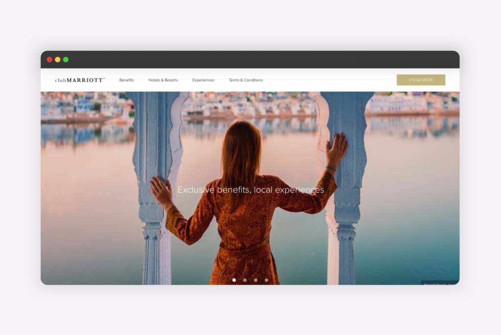
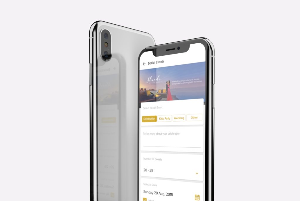
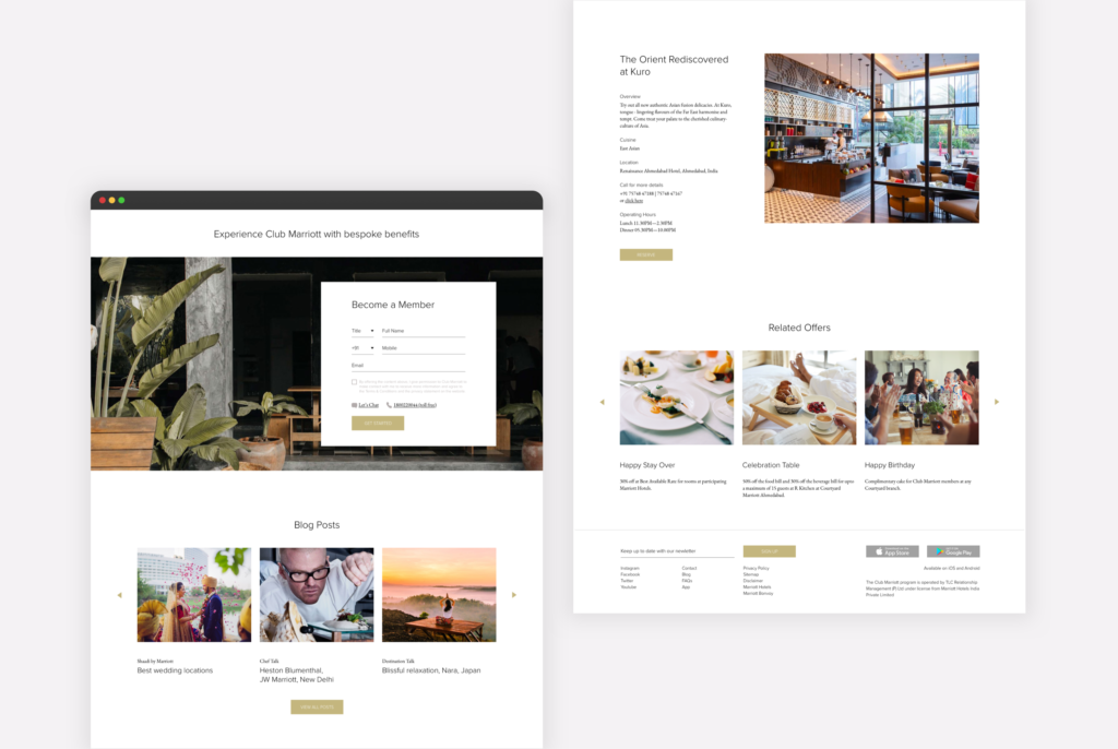
As an introduction to Club Marriott, we worked on a microsite for their partnership with HDFC. The website was designed to promote exclusive privileges at over 300 participating hotels and resorts across Asia-Pacific for HDFC Infinia credit-card holders.
The website follows a clean layout, favouring content hierarchy. The use of line drawings acts as visual guides for the content. The drawer animation highlights the form to users and encourages them to avail the offer.
The microsite helped us understand Marriott’s visual language and tone of voice. Through this, we were able to create a design language that we applied to subsequent websites.
This is a Video Caption
Line animations designed for the Club Marriott and HDFC microsite.
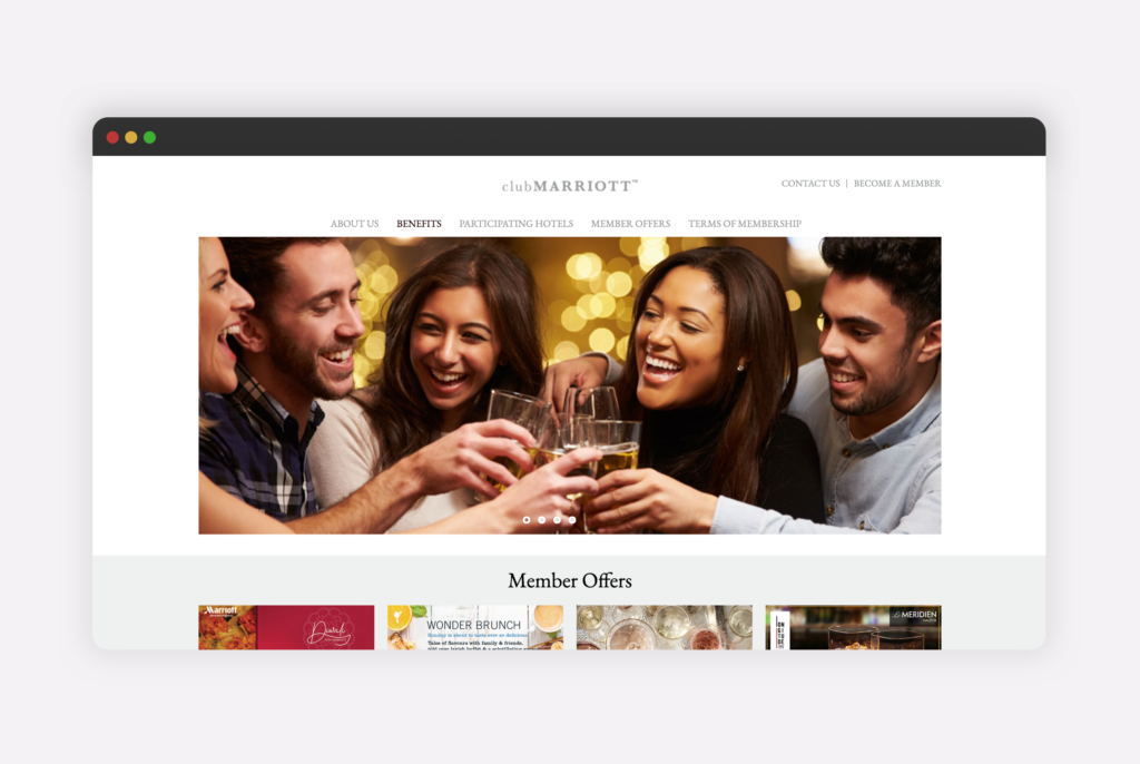
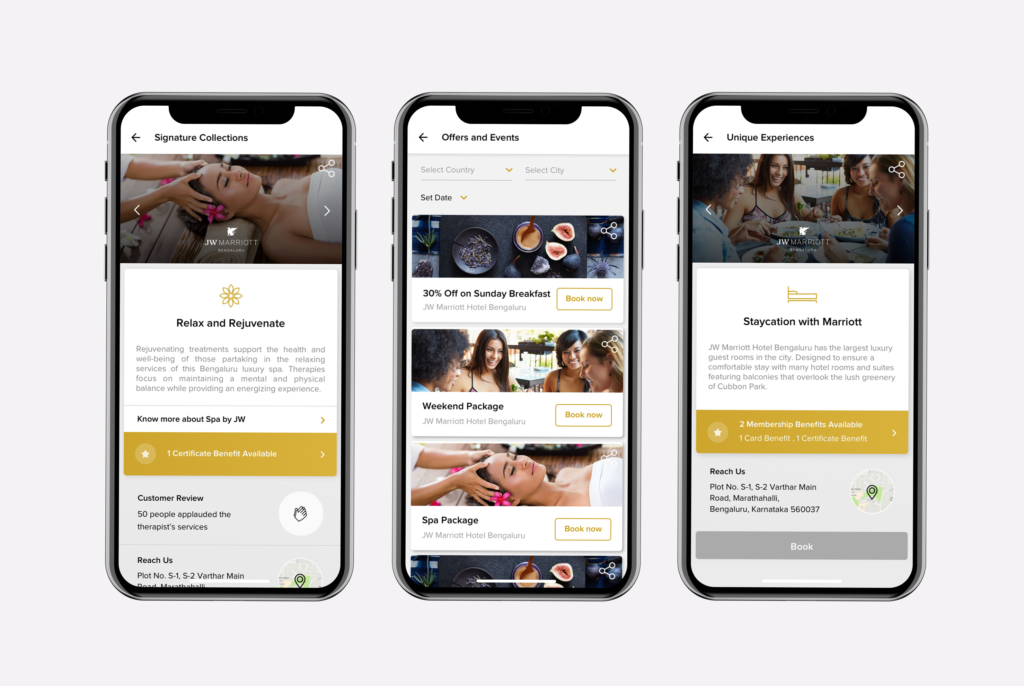
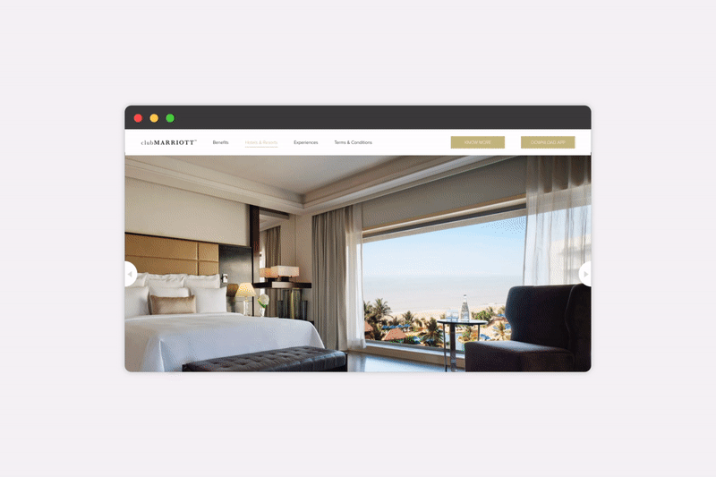
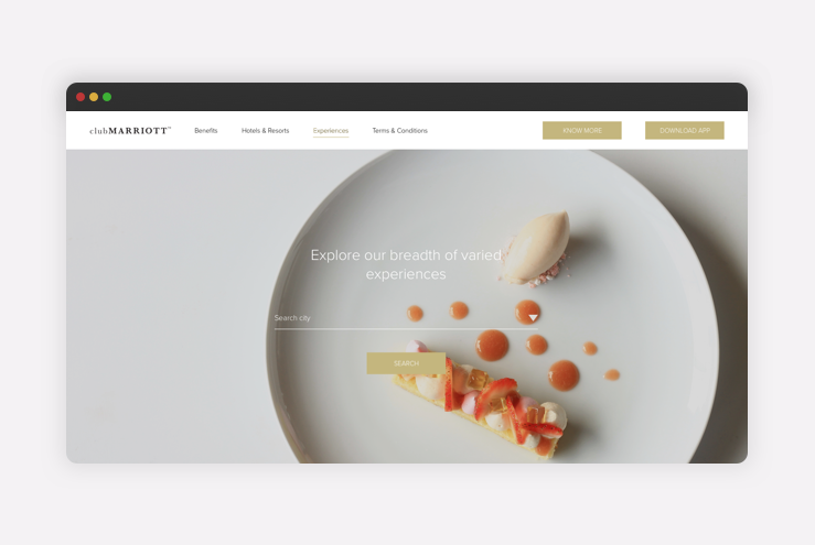
Club Marriott Website, Asia-Pacific
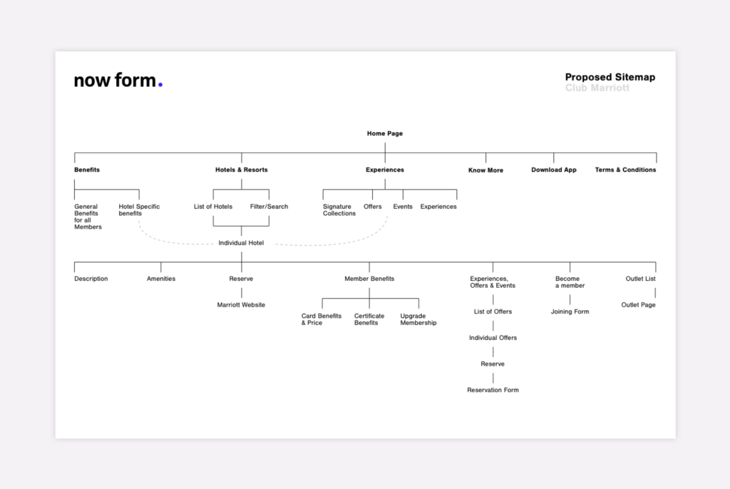
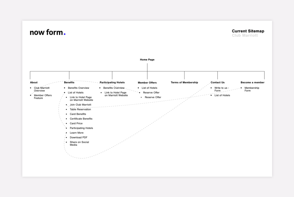
The existing Club Marriott website was dated and lacked a logical content structure. Moreover, it was difficult for participating hotels to update and manage.
The new website built on Adobe Experience Manager allows easier content management. Using AI and analytics tools, the website reorganises itself to create personalised user experiences.
The website and mobile application were designed keeping this dynamic structure in mind. By using repeating visual systems, information can be easily shown, hidden or reordered based on visitor behaviour. By creating smarter content, we can assess user intent, thereby improving customer experience and sales.
“By using repeating visual systems, we can easily reorder, show, and hide information based on visitors behaviour. By creating smarter content, we can assess user intent, thereby improving customer experience and sales.”
The mobile application and website share a single content structure. Keeping the structure in mind, we designed layout variations for the app, making it more dynamic.
We also designed and tested the website to be accessible for people with visual impairments. Learn more about accessibility guidelines here.
The new website is visually pared back, allowing the content to take centre stage. By keeping the layout neutral, we were able to make it aesthetically relevant for the spectrum of Marriott brands. By segmenting the ClubMarriott website into benefits, offers and properties, we made the program simple to understand and easy to navigate.
The property page demonstrates the flexibility of the website. Accordions make it easy to add or remove sections, without compromising on usability. This dynamic structure also gives Marriott numerous cross-selling opportunities.
The project involved various stakeholders from business, marketing, content, and implementation. We created style guides for the assets to avoid design breakdowns across the multiple teams.
Given that India’s population includes around 150 M Dairy Farmers and 300 M Dairy Animals, Kissaan—an agritech app—caters to the needs of as much as 58% of the Indian population. Cattle-based revenue is a significant portion of the income for small farmers in India.
As an introduction to Kissaan, our design team analysed and redesigned the architecture and UI for their existing POC screens. Based on benchmarking and secondary research, we suggested additional functionality, UX improvements and new digital interventions that made the experience more seamless and robust.
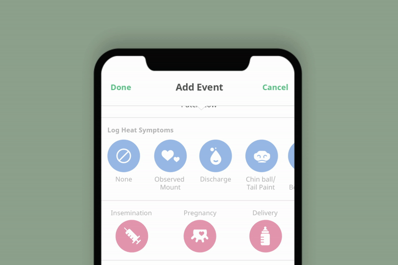
In response, Kissaan approached us to design the architecture and functionality for the remaining application. Our solution allows farmers to record and manage their cattle and optimise their yields and profits through features like smart suggestions, tracking health symptoms and heat cycles, social marketplace solutions, veterinary assistance, and self-service FAQs. It also facilitates interest generation via collateral content like scratch-cards and a social-feed where users can post events, discussions, educational videos, and tips.
Now Form also designed the presentation-deck for Kissaan’s Series-A fundraiser, showcasing their business and launch strategy, value proposition and current and future app functionality.
Understanding the landscape
Our research involved studying Kissaan’s competitors and understanding the landscape of cattle management in India. We identified core functionality and features through secondary research, our discussions with the client, and through the findings of their research and user-testing.
We benchmarked several cattle management apps, which helped us identify the functionality and pain points of existing solutions. For example, the interface of most existing solutions feel unfamiliar and unintuitive; Tracking and inputting heat cycles and symptoms is represented as static information with little to no visual cues.
“By benchmarking functionally similar interfaces such as menstruation apps (designed to be visually representative and intuitive to learn), we were able to address the optimal visualisation of yield and fertility cycles.”
The UI of many existing solutions is cluttered and dated. Essential information, tasks and actionable items lack categorisation and hierarchy, making it harder to visualise and parse.
By benchmarking functionally similar interfaces such as menstruation apps (designed to be visually representative and intuitive to learn), we were able to address the optimal visualisation of yield and fertility cycles. The UI of many existing cattle management apps is also cluttered and dated. Essential information, tasks and actionable items lack categorisation and hierarchy, making it harder to visualise and parse through information.
Studying Facebook’s marketplace also informed our solutions for an eCommerce-friendly social feed on the Kissaan app, used to trade and purchase cattle, and buy produce.
Kissaan 1.0
Now Form first analysed and redesigned Kissaan’s existing POC screens, suggesting digital and functional interventions to improve the experience.
Cattle Details: We designed the UI to ensure that everything is upfront and easy to access. Menu items include clear iconography and text labels. All cattle are displayed in a horizontal carousel at the top of the screen so that users can effortlessly compare cattle statistics. The cattle details feature an overview of each animal’s bio (breed, cattle type, gender, description) and yield over time.
Entering yield: We suggested three approaches to entering yield (based on technical feasibility and ease of use). The first option displays the cattle as a list; The method of entering the yield is interactive, with sliders and dynamic numbers to visualise quantities and ease comprehension. The second option also uses sliders and dynamic input, but unlike the list-format of the previous option, the yield can easily be input as per the user’s preference which avoids unnecessary scrolling. In the case of batch entry, the yield for multiple cattle can be input in one go. The third option suggests leveraging the technologies of a smart-phone or smart device that can measure the weight or volume of milk. In this case, the application functions as a display of data and analytics. The farmer need only map the data to the cow, reducing the chances of error from manual entry.
In all options, the time of the day is automated. In case an entry is missed, the user is notified and redirected to the missed entry log where they can easily input the data for the missing days.
“We ensured that the UI and experience cater to a semi-literate audience and that it is regionally compatible across India.”
Accessibility and regional considerations: We ensured that the UI and experience cater to a semi-literate audience and that it is regionally compatible across India. For example, the app recognises voice-based entry and includes an audio play feature on the header to dictate the page title and function to users in their language. The iconography style is designed to be representative rather than overly abstract and is accompanied by text-labels for added clarity. Additionally, we used the Google web font Noto Sans, which supports a variety of regional languages, allowing seamless translations of the app and faster load times in low connectivity areas.
Kissaan 2.0
As the next step, Kissaan approached us to design the UI and functionality for the entire application. The app was made more comprehensive with new features, including:
Cattle Listing and Profile: The app includes a dashboard of all cattle, their current cycles, and the total overall yield. Colour and visual indicators on cattle images, for male, female and gestation, help filter and identify them at a glance.
Each cattle can be archived and marked as sold, bartered, or diseased, moving them into a separate tab. Additionally, along with providing information regarding the animal’s bio and yield, the individual cattle profiles also give farmers information about their cattle’s current heat or gestation cycle and a checklist of daily tasks. We categorised the tasks, with icons, into 4 overall types- gestational, medical, observational and yield-related tasks.
Tracking cycles and logging health symptoms: A more detailed view of each cattle’s heat and gestation cycles is accessible from within the cattle profile. The goal is to show information visually and comprehensively, keeping it simple to understand and navigate.
We benchmarked menstruation apps like Flo, Clue, and Period Calendar. Through this, we created more robust and intuitive solutions for tracking heat and gestation, and for entering medical events, milestones, and health symptoms; Many existing cattle management apps fail to do this in a visually intuitive way.
Our solution includes clear, primary action buttons and daily smart suggestions and tips, available upfront on the cycle-interface. Symptoms and logs are categorised into sections with colour-coded icons so users can easily find and input them.
Daily tasks: This section provides a dashboard overview of the number of cattle in their respective phases of the heat cycle and an expandable checklist of daily tasks for each cattle. Smart adjustments and notifications for missed or late tasks, ensure that users do not miss vital steps and procedures.
Social feed and cattle marketplace: Users can post content and engage in community discussions on a social feed within the application. Through the provision of filters and tags, the Feed also functions as a simple, non-transactional marketplace where users can buy or sell cattle. We benchmarked apps like Facebook (Marketplace) and Instagram to identify the best practices for implementing marketplace functionality within a social-interface.
Milk Market: Users can list themselves as milk suppliers on the app, displaying their price per litre, average total yield, and a link to contact them (via whatsapp or email). Through ratings shared by previous buyers, other prospective customers can ensure the product and seller are authentic and verified.
FAQ, Veterinarian Services, and Scratch Cards: The app also includes an educational and assistive component; Users can access quick query resolution, best practices, and cattle rearing tips through an in-app FAQ section. Additionally, users can also contact Kissaan’s 24/7 on-call vets for professional guidance, tips, and assistance, directly through the app. Calls are placed at standard calling charges however users can also leverage in-app rewards earned through activity-based scratch cards.
Investment deck for Kissaan’s Series-A fundraiser
Kissaan approached us to design a presentation for their Series-A fundraiser, showcasing their business and launch strategy, value proposition and current and future app functionality. We benchmarked pitch decks of big-tech companies to determine the best approaches and practices for structuring and representing the content.
Our solution helped establish a cohesive and branded presentation format, ensure that the information is clear, straightforward, and concise, and that data and statistics are displayed graphically and intuitively for better comprehension and parsability.
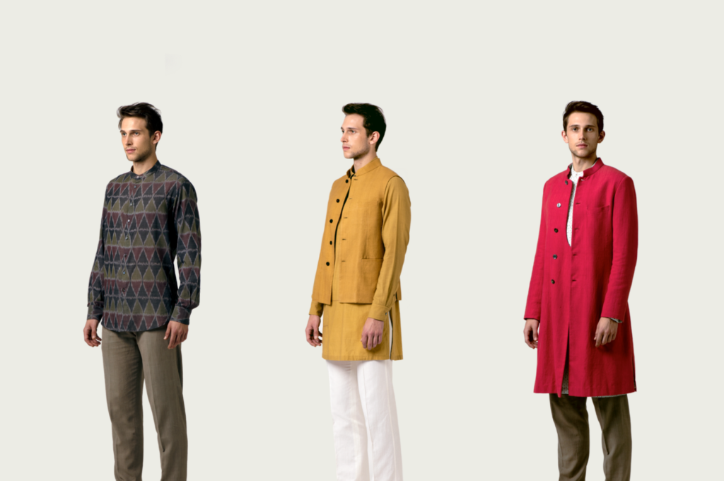
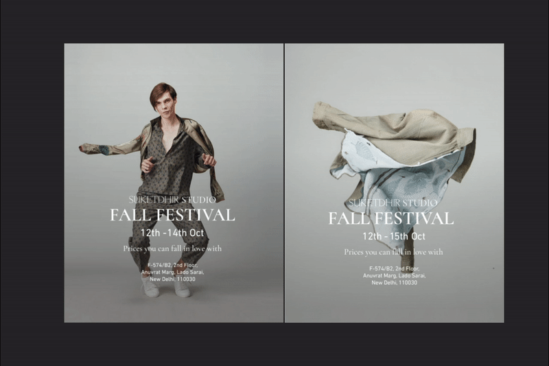
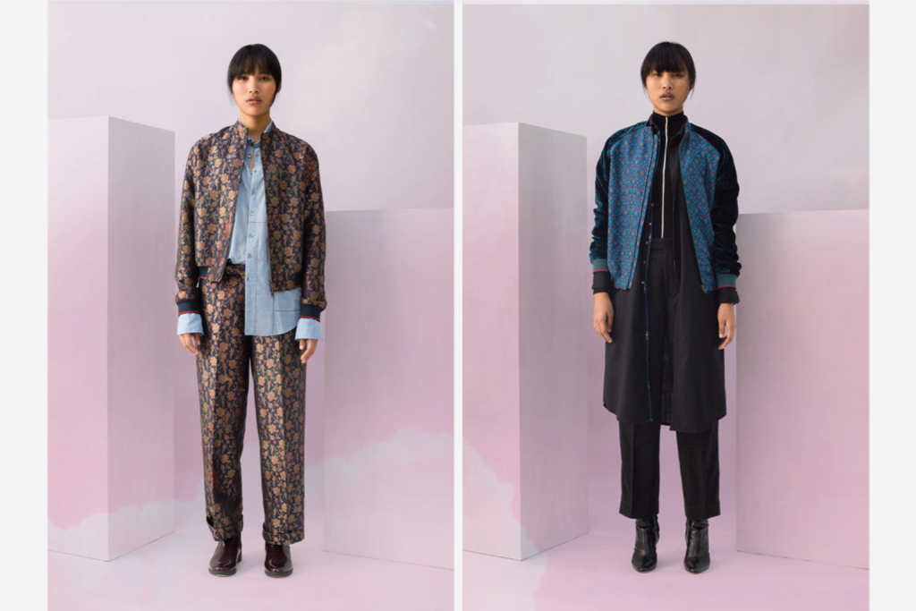
SUKETDHIR is a leading Indian luxury apparel label. Their innovation in indigenous textiles, attention to detail, and quality craftsmanship has brought the brand international recognition. The brand won the prestigious Woolmark prize in 2016 and featured on the cover of the New York Times & The Economist.
Over the last few years Now Form has worked with SUKETDHIR to create their brand identity; This includes all their collateral, communications, brand book, and website. Additionally, we oversee and direct their photoshoots and have also designed video collateral for the label.
Rebranding India’s best menswear brand
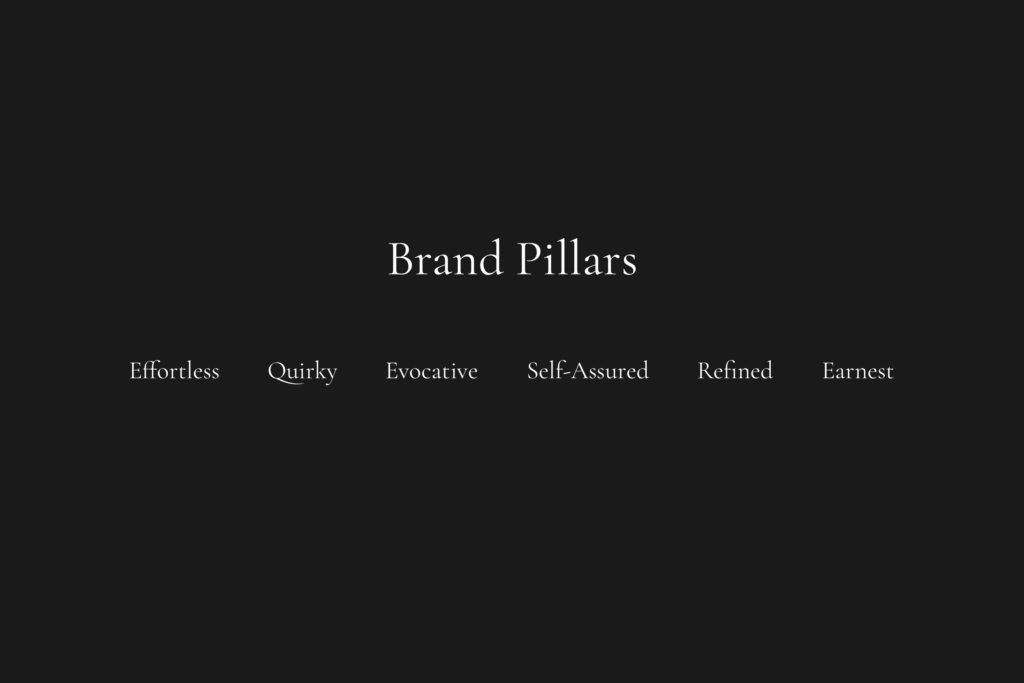
We worked closely with the founder, Suket Dhir, to understand the ethos of the brand. Through numerous discussions with Suket, customers, friends, and stockists, we were able to establish guiding principles for the brand. SUKETDHIR was synonymous with playful luxury. Our brand pillars enabled us to create a consistent brand language; one which was easy to communicate with other collaborators.
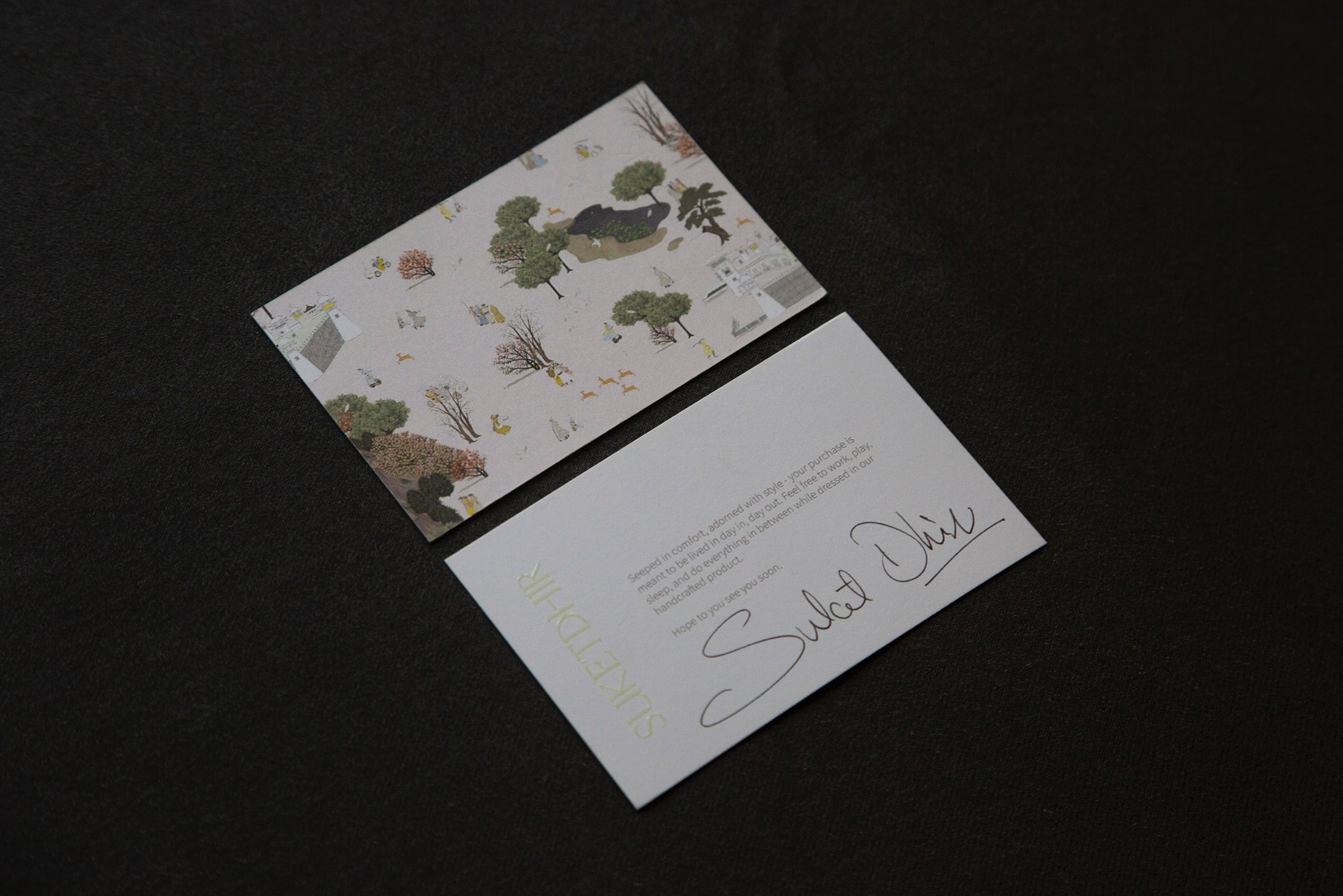
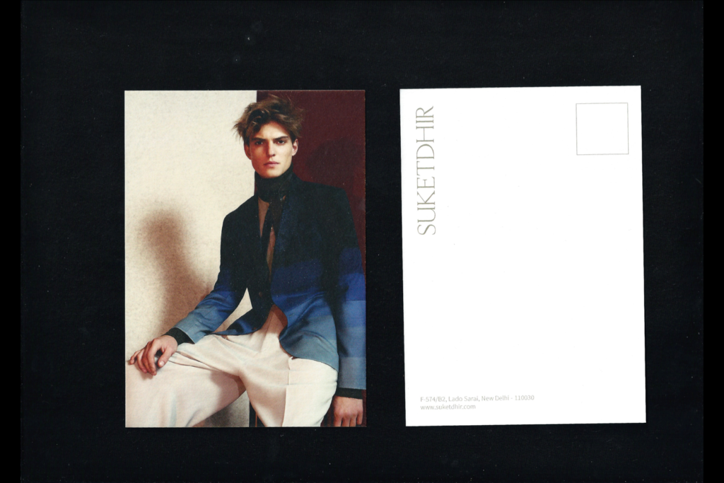
Brand Collateral
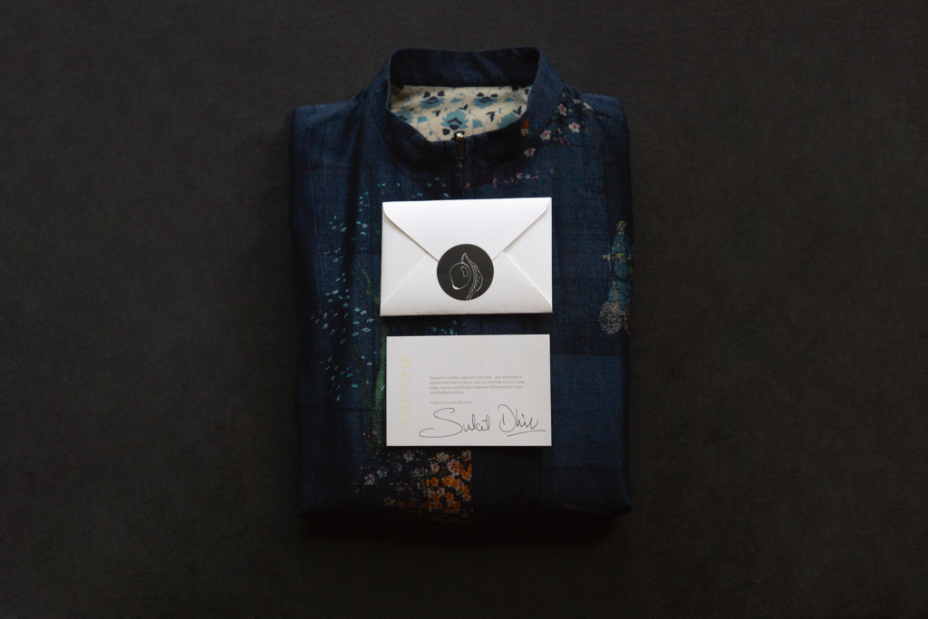
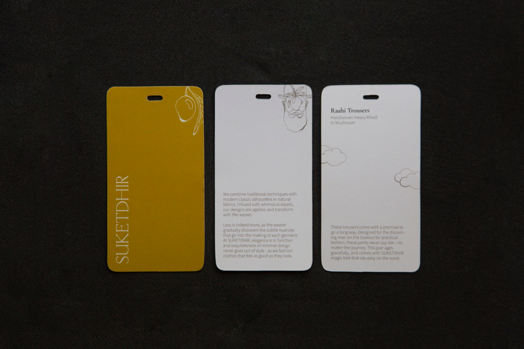
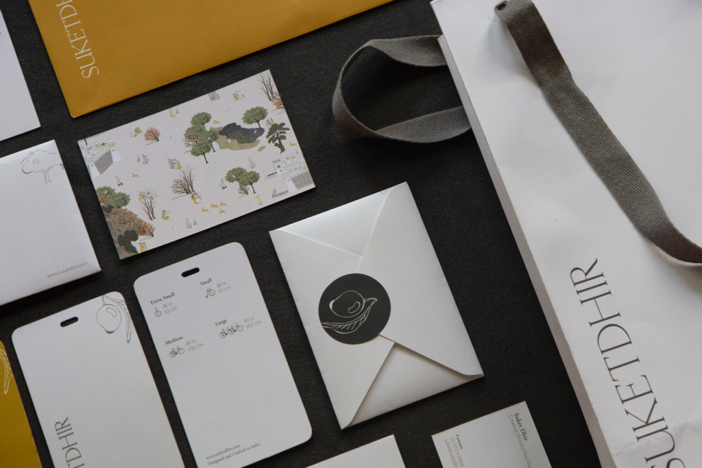
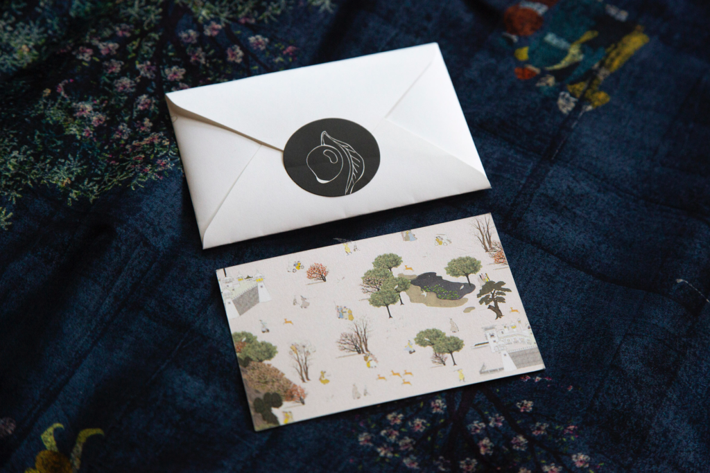
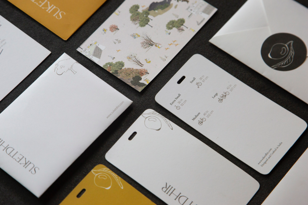
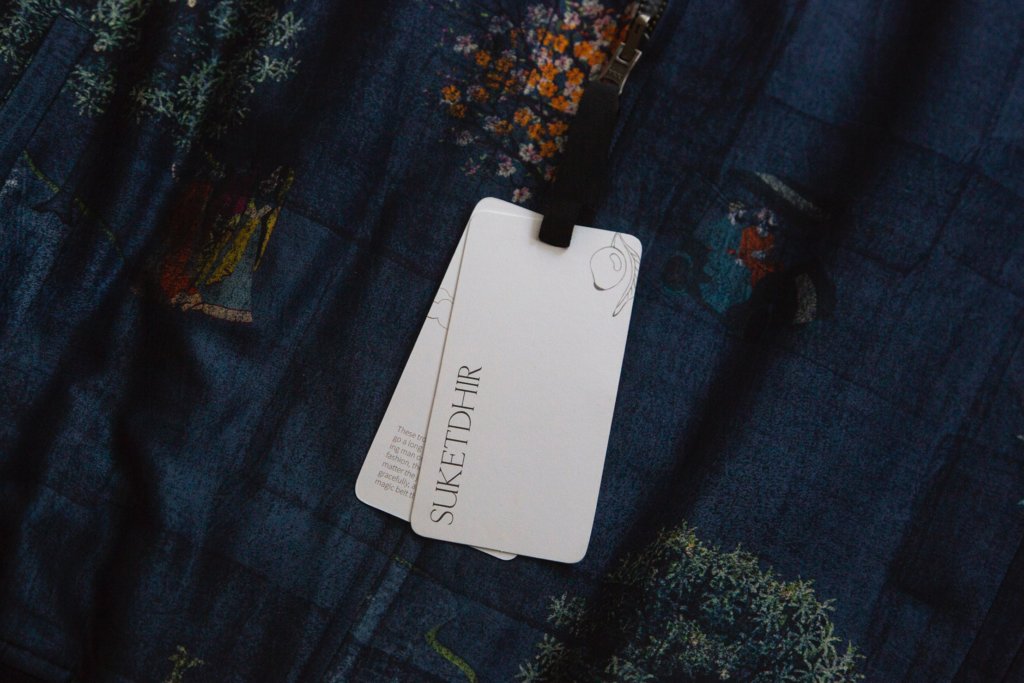
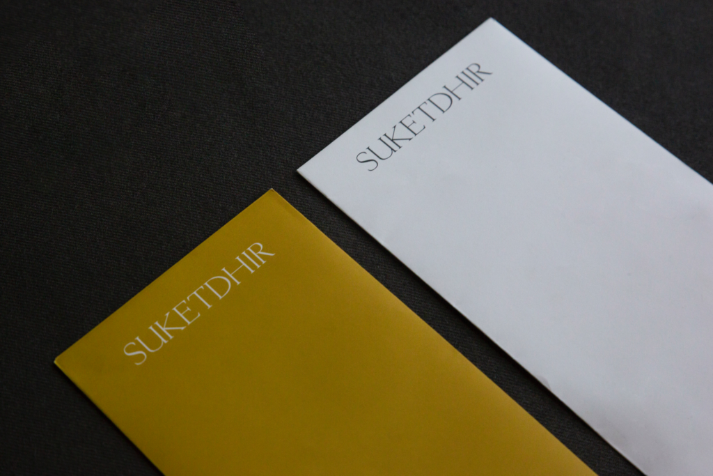
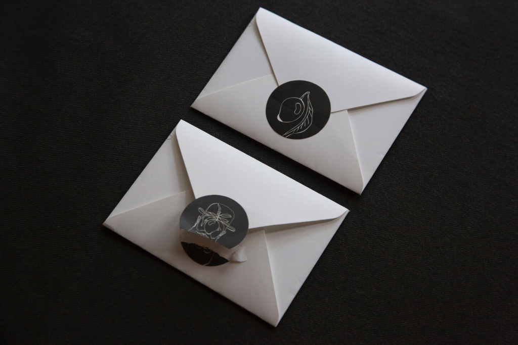
Quirk, effortlessness, and nostalgia are central to the SUKETDHIR brand. The brand collateral designed for SUKETDHIR echoes these sentiments.
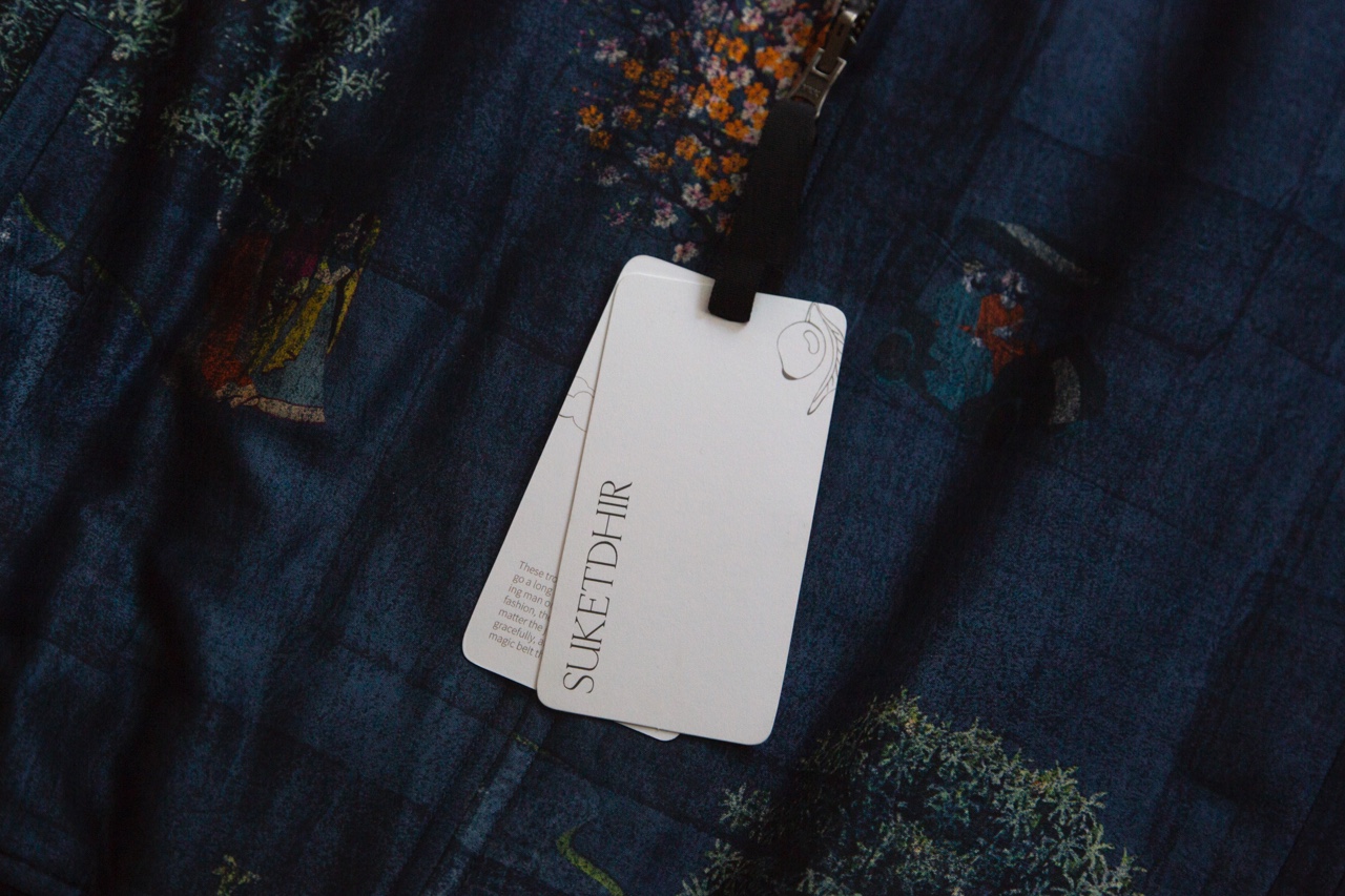
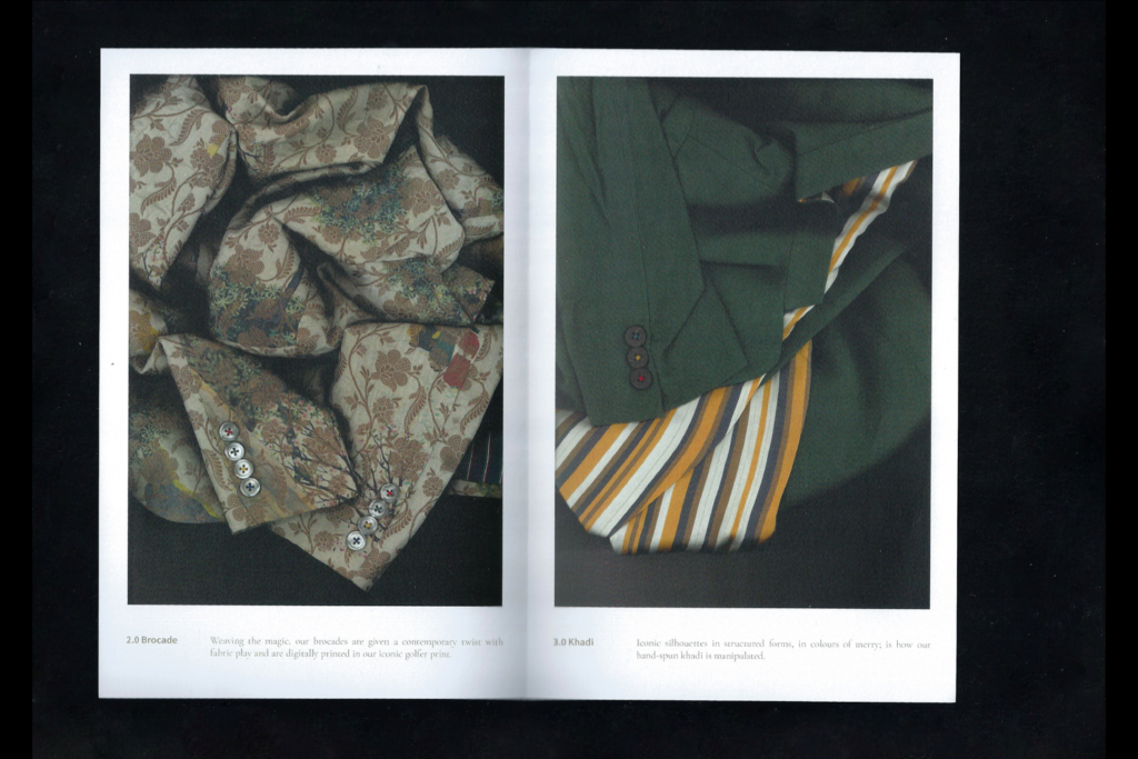
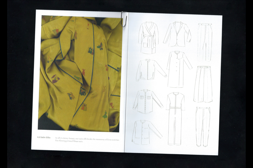
SUKETDHIR’s clothes are rich in design details. The subtle and often hidden embellishments are for the enjoyment and discovery of the wearer. Playful prints are used to line the garments.
“Stumbling on a yellow business card in a stack of ivory cards should bring the customer the same sense of discovery and amusement as finding a hidden detail in the garments.”
We used undulating line drawn versions of iconic SUKETDHIR prints/motifs on our collateral for the brand. The variation in line weight gives the icons a handmade and feminine (nazakat) vernacular. Much like SUKETDHIR’s garments, the collateral pieces have a simple design. While all of the collateral is ivory, there are a few random pieces designed in the label’s signature yellow. Stumbling on a yellow business card in a stack of ivory cards should bring the customer the same sense of discovery and amusement as finding a hidden detail in the garments.
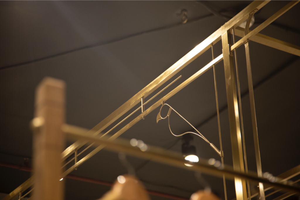
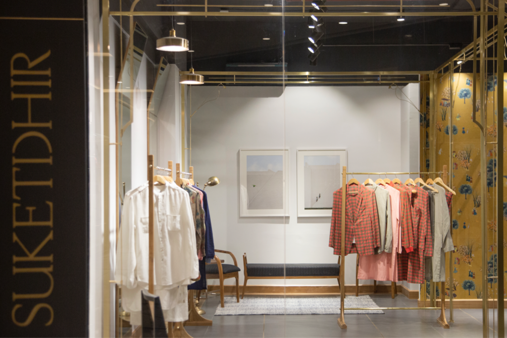
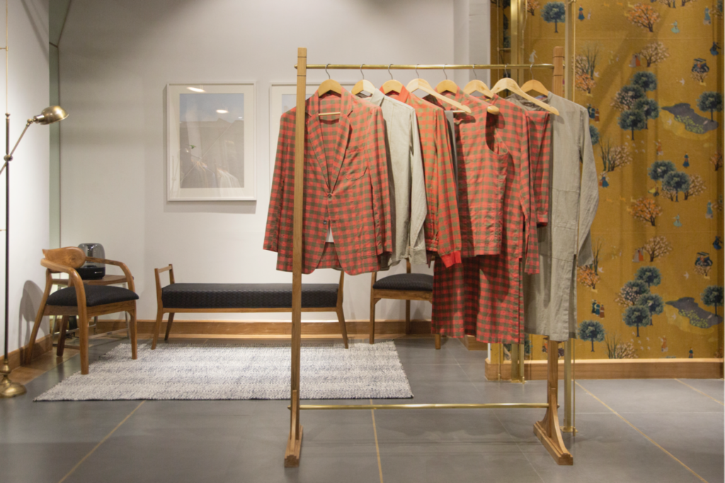
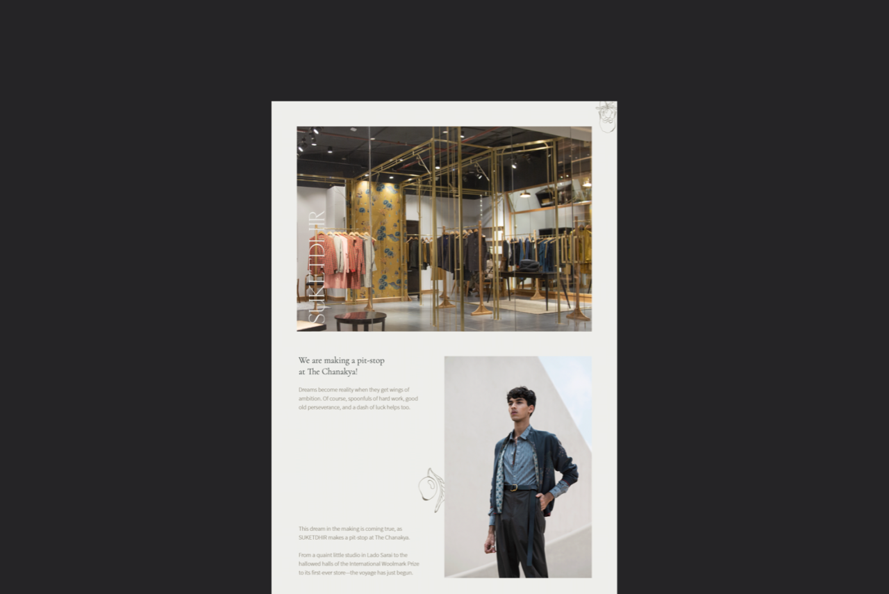
SUKETDHIR Pop-up Store
Interior Designer, Vibha Hooda designed the SUKETDHIR pop-up store at The Chanakya. We worked with Vibha to ensure that the interiors followed the same brand language. Like in our collateral designs, SUKETDHIR motif’s were hidden into the trellis-work of the store. We designed the store signage using micro concrete sheets and engraved typography.
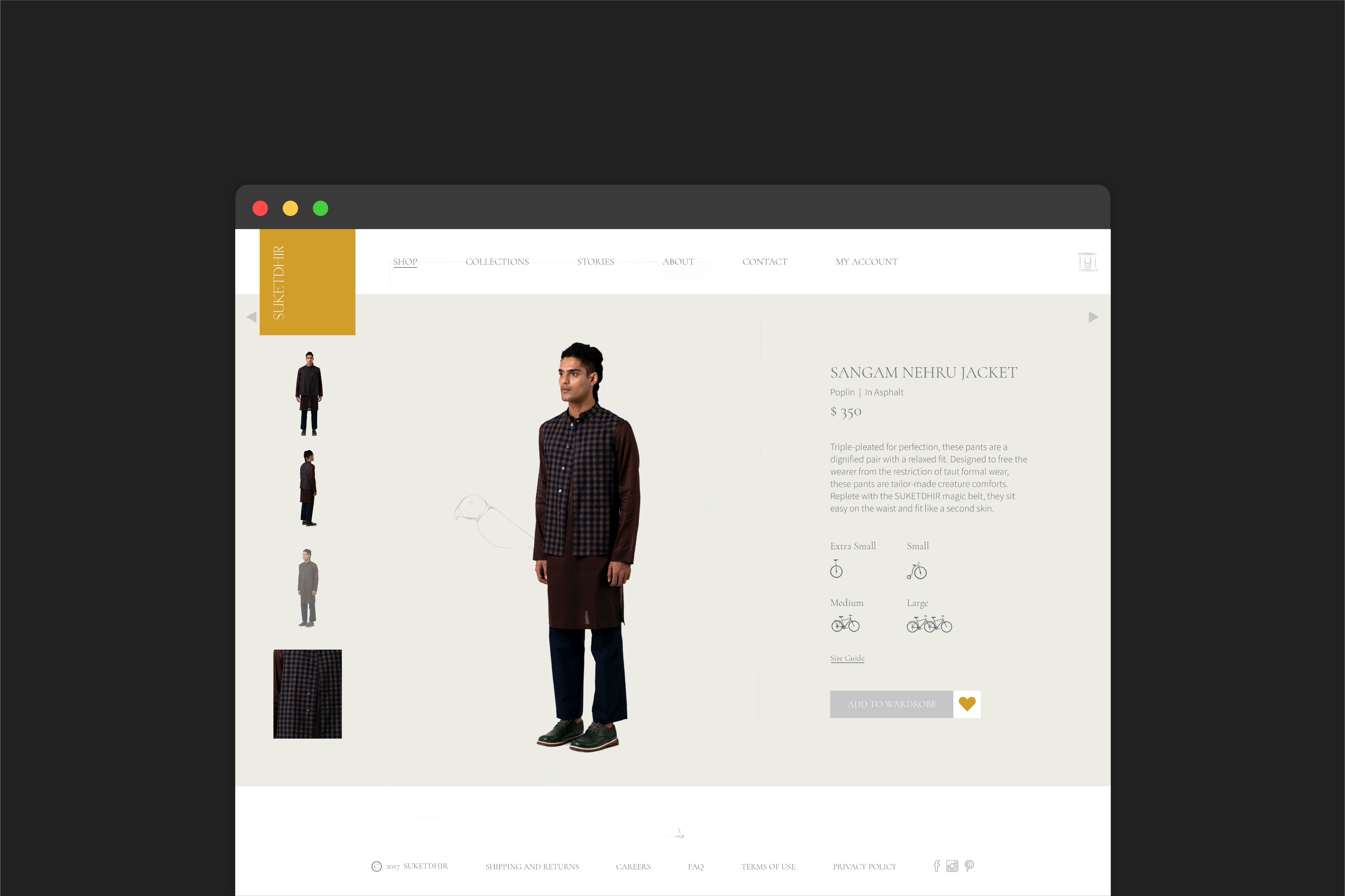
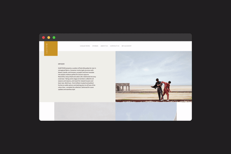
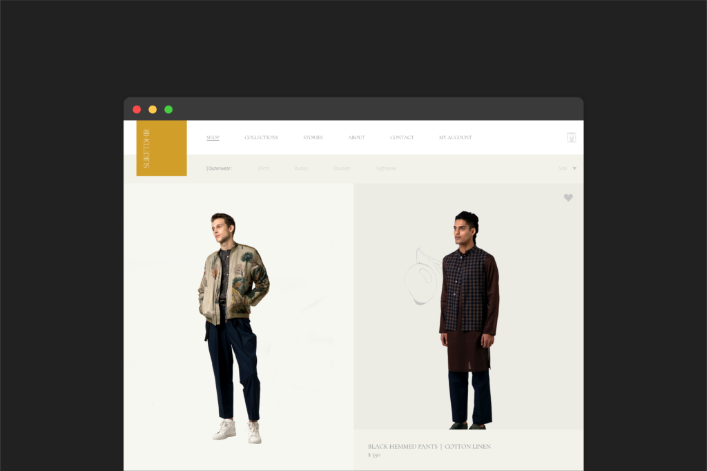
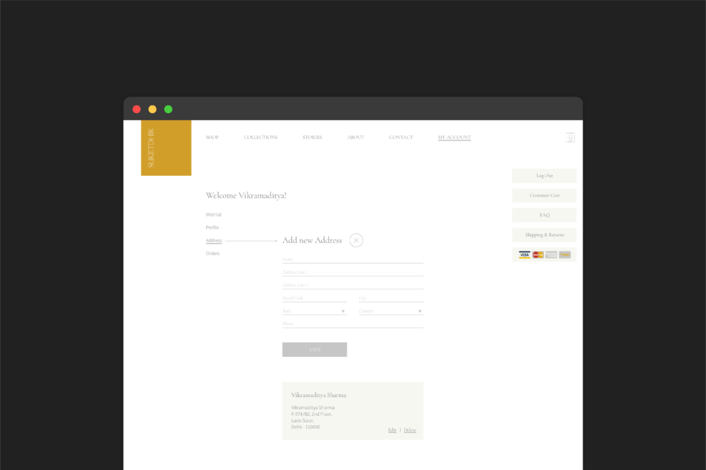
Our team of User Experience designers created a responsive website for SUKETDHIR. As a website for a luxury apparel company, the intention was to design a website that was e-commerce friendly while being narrative and memorable. The interactive homepage (on desktop) discards traditional e-commerce patterns and brings the brand imagery and language to the forefront. The e-commerce website allows the buyer to customize garments as well.
“The interactive homepage discards traditional e-commerce patterns and brings the brand imagery and language to the forefront.”
Custom iconography, in line with the brand’s spirit, can be found across the website. Drawing inspiration from the brand’s garment tags, different bicycle sizes are used as icons for the sizing chart. We replaced the traditional shopping cart with a wardrobe, and a click on the bowler’s hat launches a hidden game.
A few images from the websites’ product photoshoot.
The website and brand language extended into the numerous digital touchpoints of the brand, including, emailers, newsletters, social media, digital invitations, and a video wall at The Chanakya, New Delhi.
Creating a consistent photography style
As an extension of our branding, we established a photographic language for SUKETDHIR. We created moodboards for different image scenarios such as product images, campaigns, lookbooks etc. Using the moodboard as a guide, we cast and directed photographers, stylists, and models on SUKETDHIR’s photoshoots.
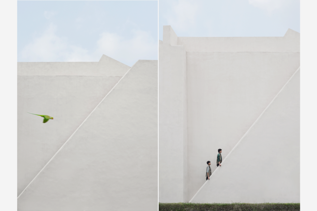
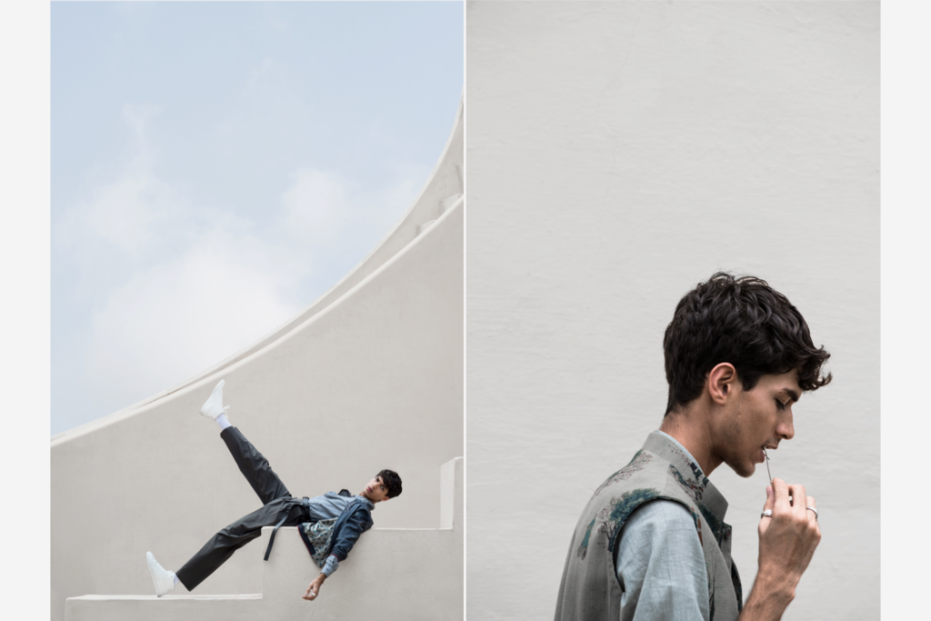
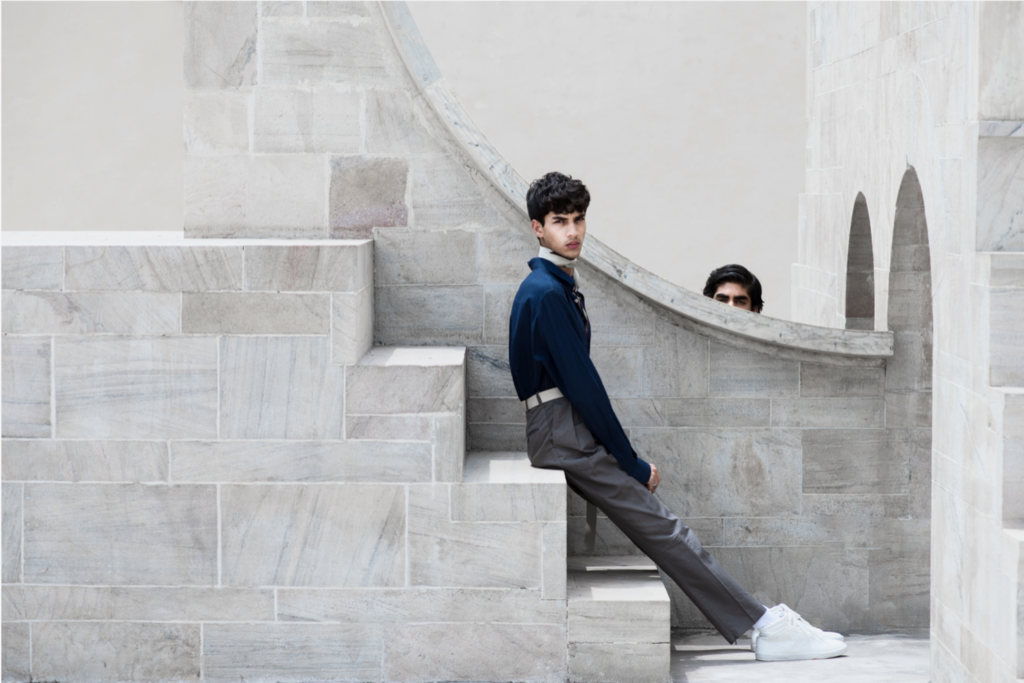
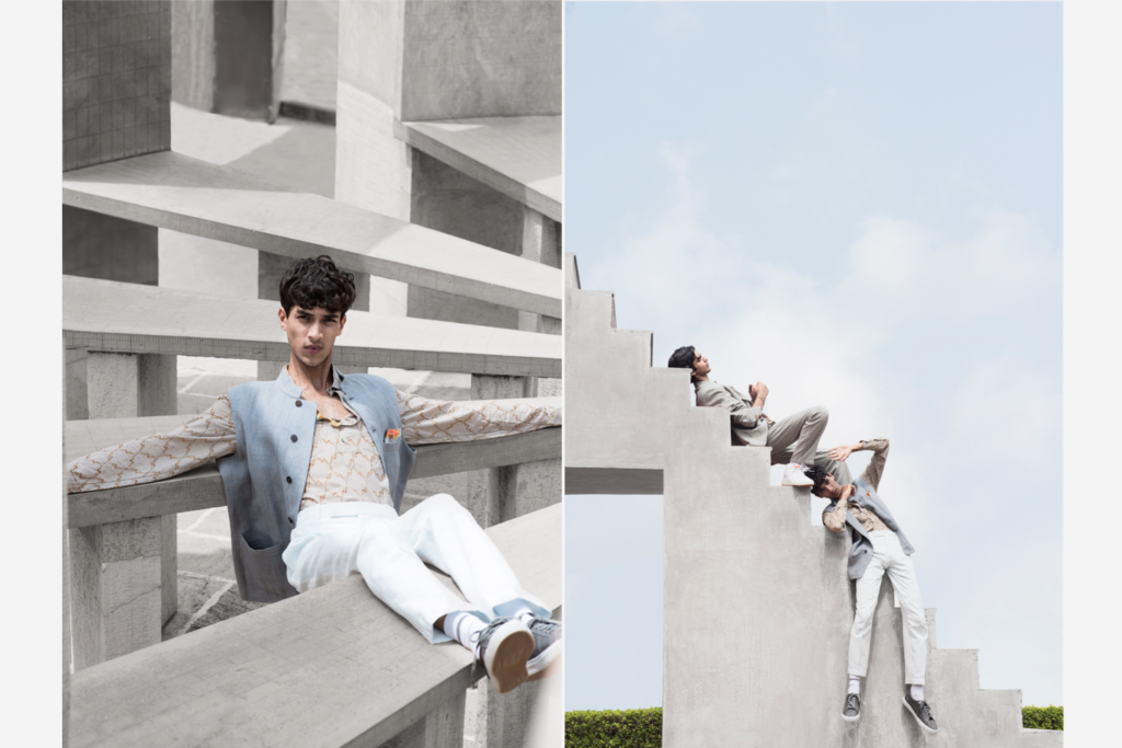
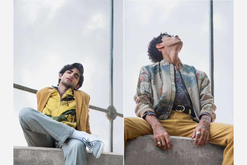
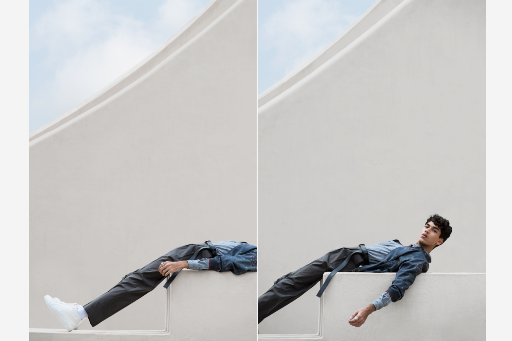
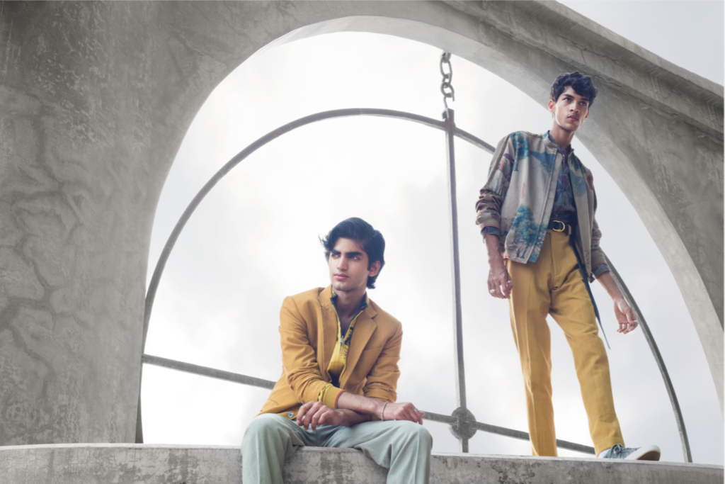
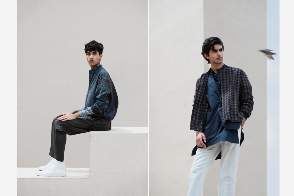
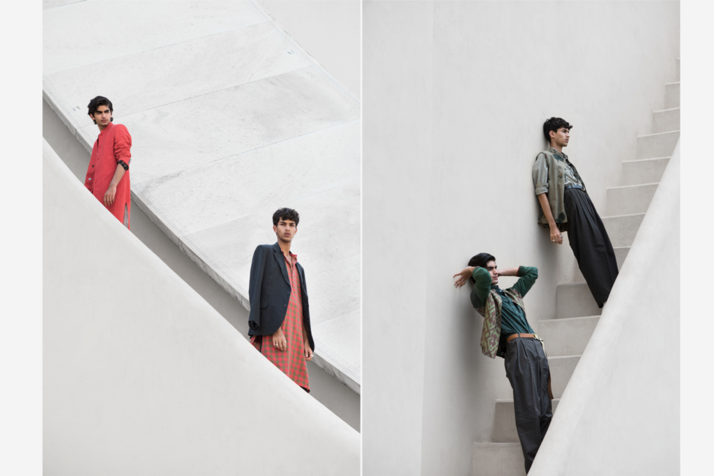
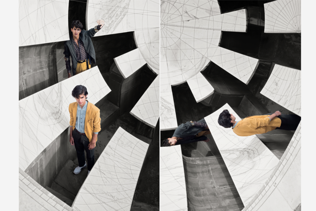
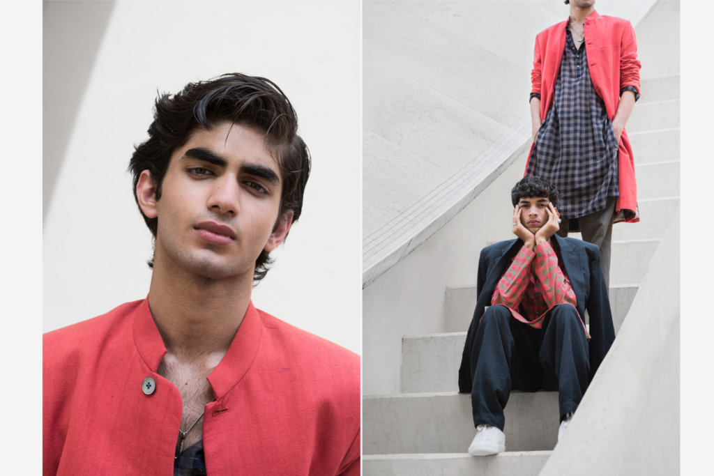
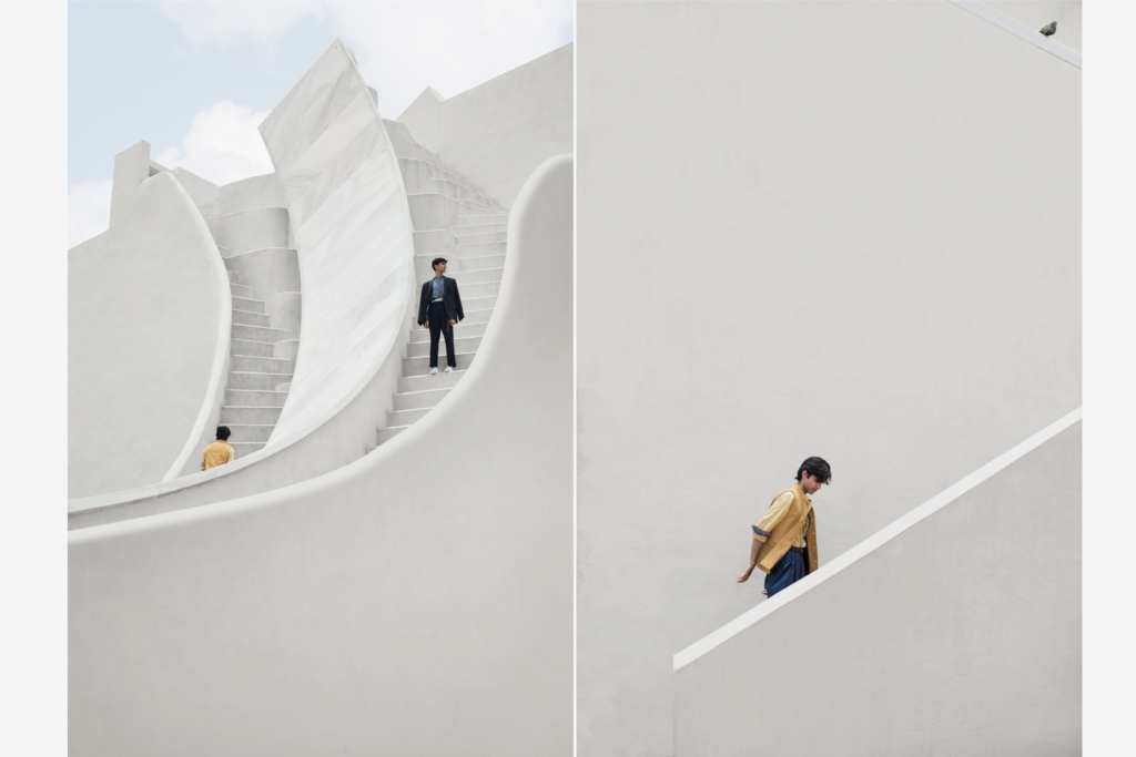
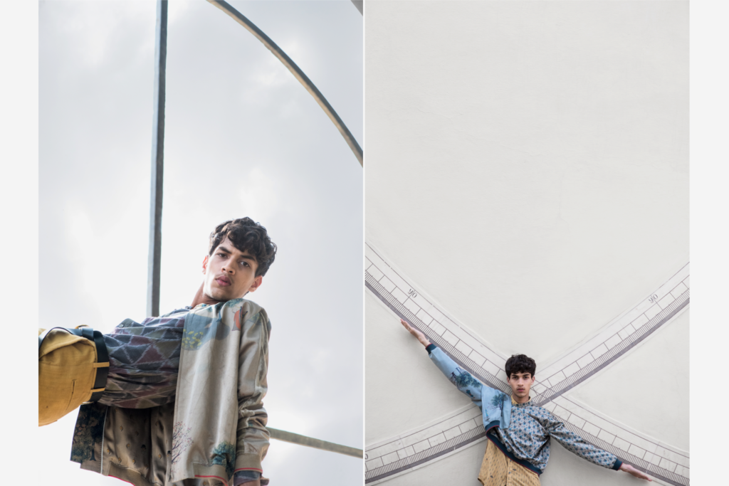
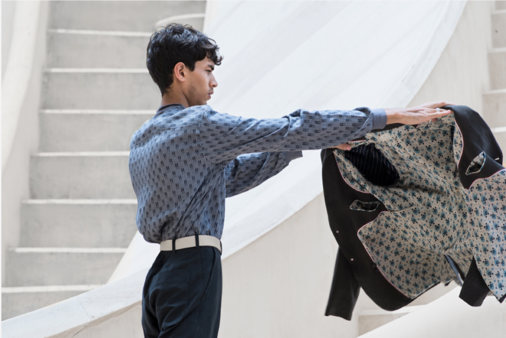
Jantar Mantar Campaign
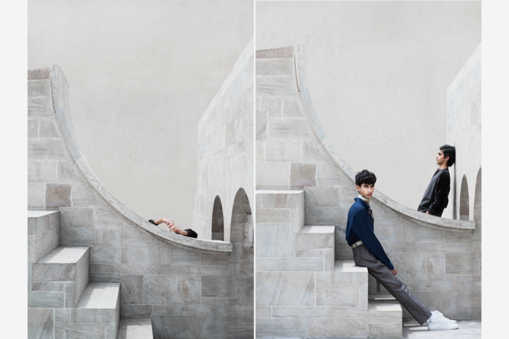
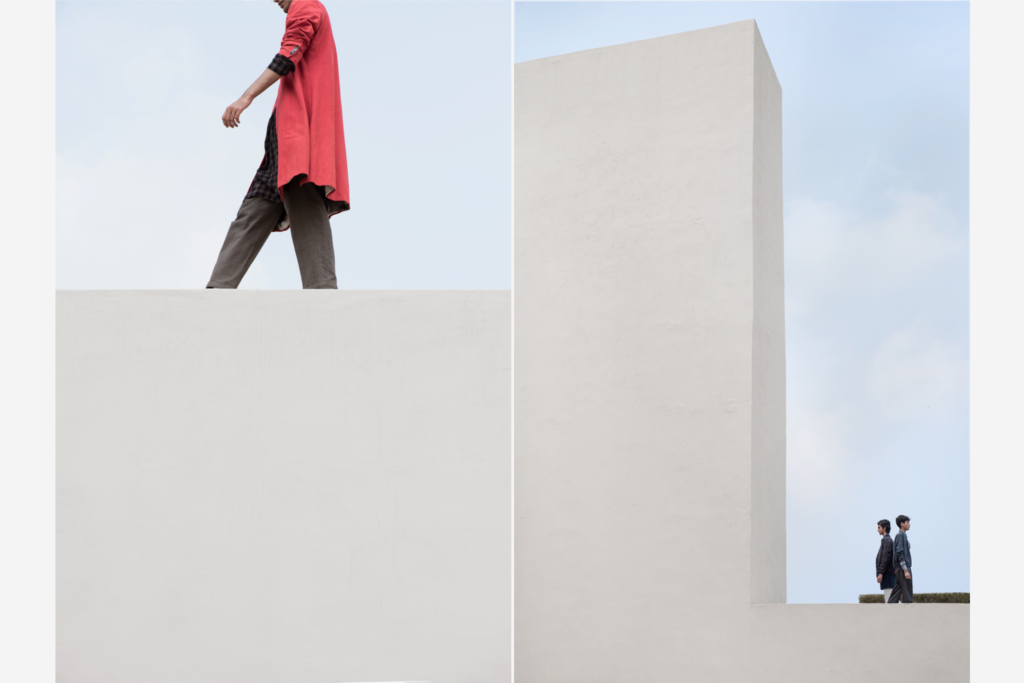
As our first campaign for SUKETDHIR, this shoot established a narrative and whimsical visual language for subsequent photoshoots. Inspired by geometry and architecture, Pranoy Sarkar took the photographs at the picturesque Jantar Mantar in Jaipur.
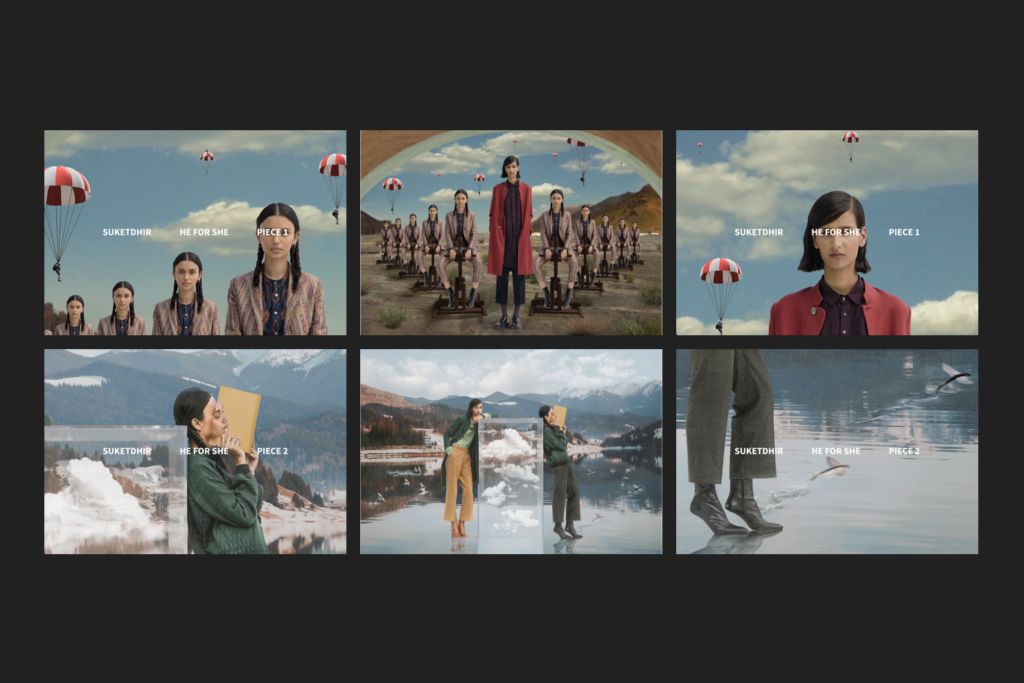
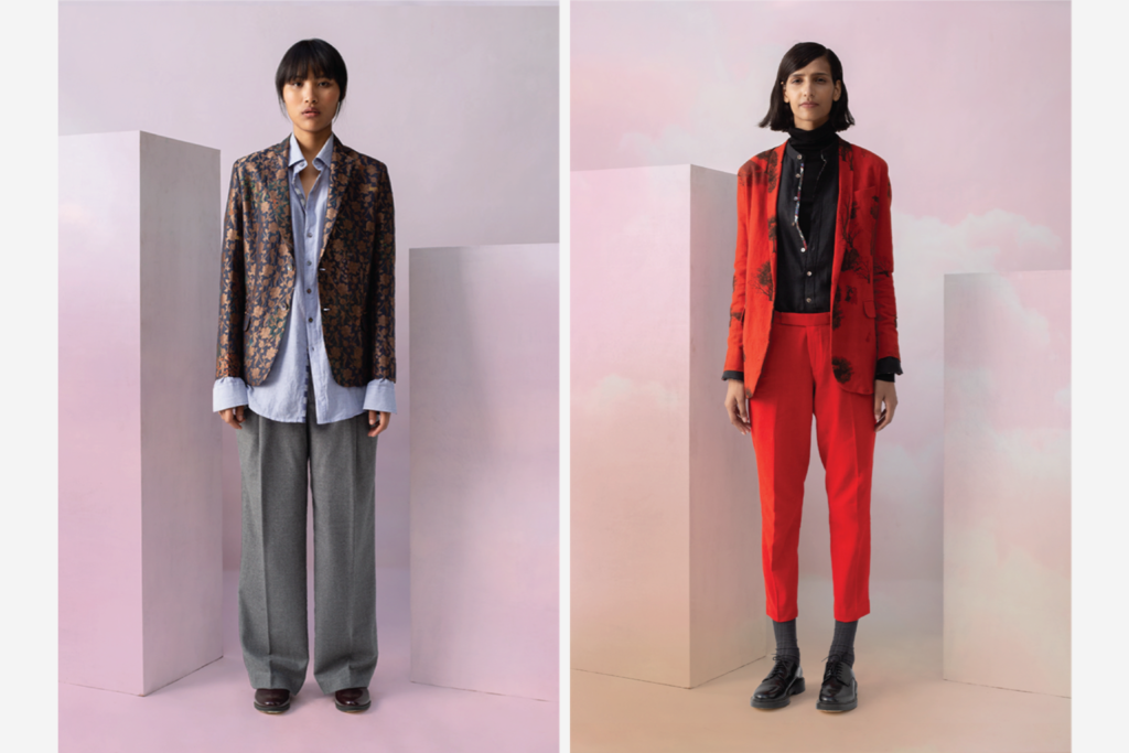
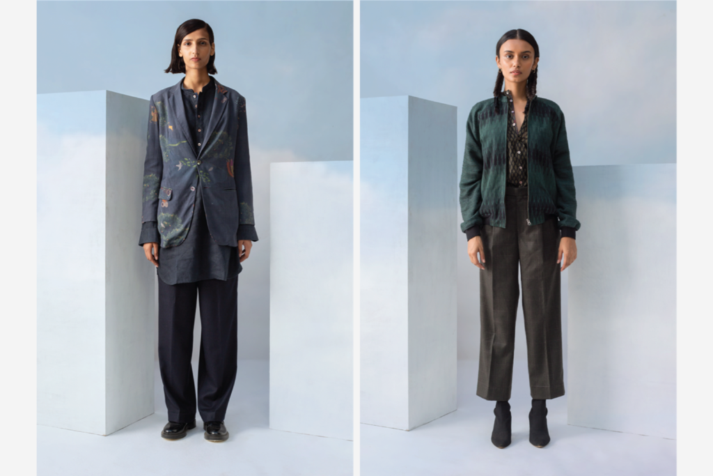
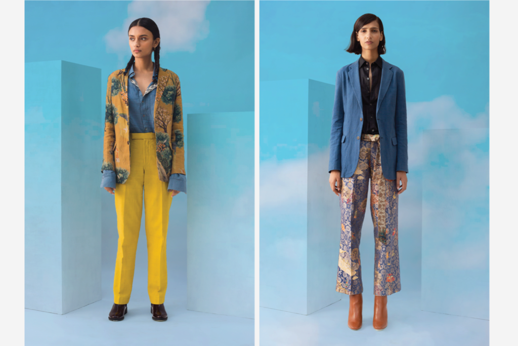
He for She Campaign & Lookbook
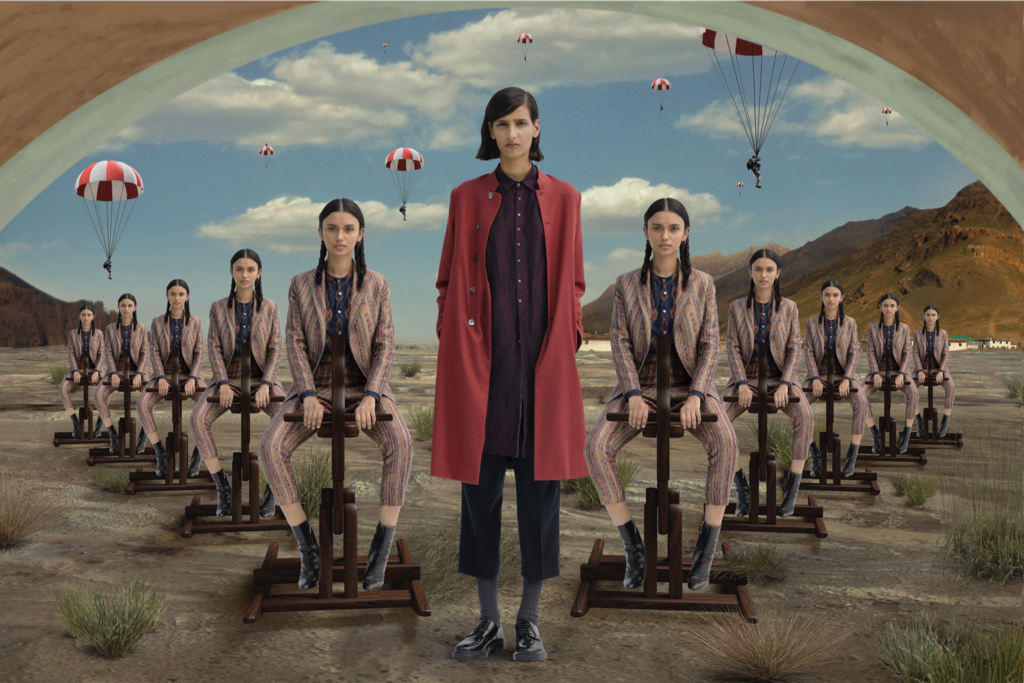
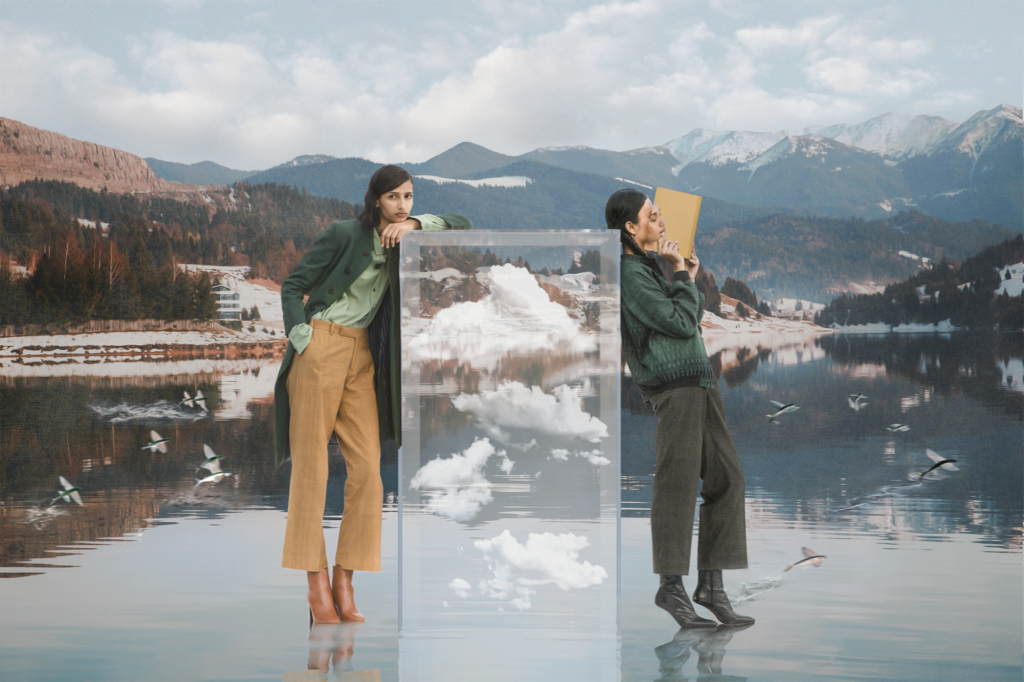
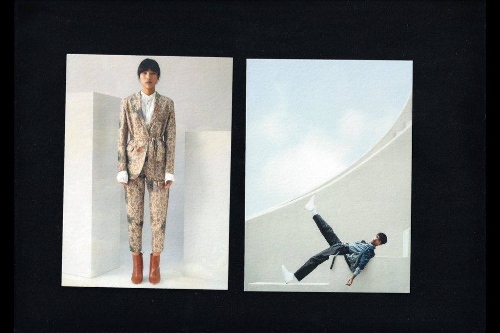
Pranoy Sarkar photographed SUKETDHIR’s, ‘He for She’ (SUKETDHIR’s womenswear collection) Campaign. The Navrasas (nine emotions enshrined in classical Indian art and literature) and René Magritte’s surrealism inspired the campaign. Our team designed the computer-generated backdrops for the photo series.
The images were posted to SUKETDHIR’s social Instagram in grids of 3. The crops showcased the details of the artwork and gave each piece the focus that it deserved.
We also directed and edited the look book for the collection. The lookbook was designed for social media and had a gradient cloud background that unfolds as a user scrolls through the feed. The lookbook preceded the campaign and acted as a pared-back precursor to the campaign’s airy and whimsical aesthetic.
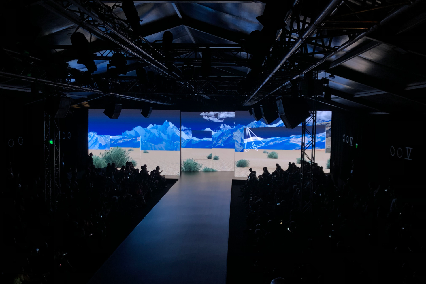
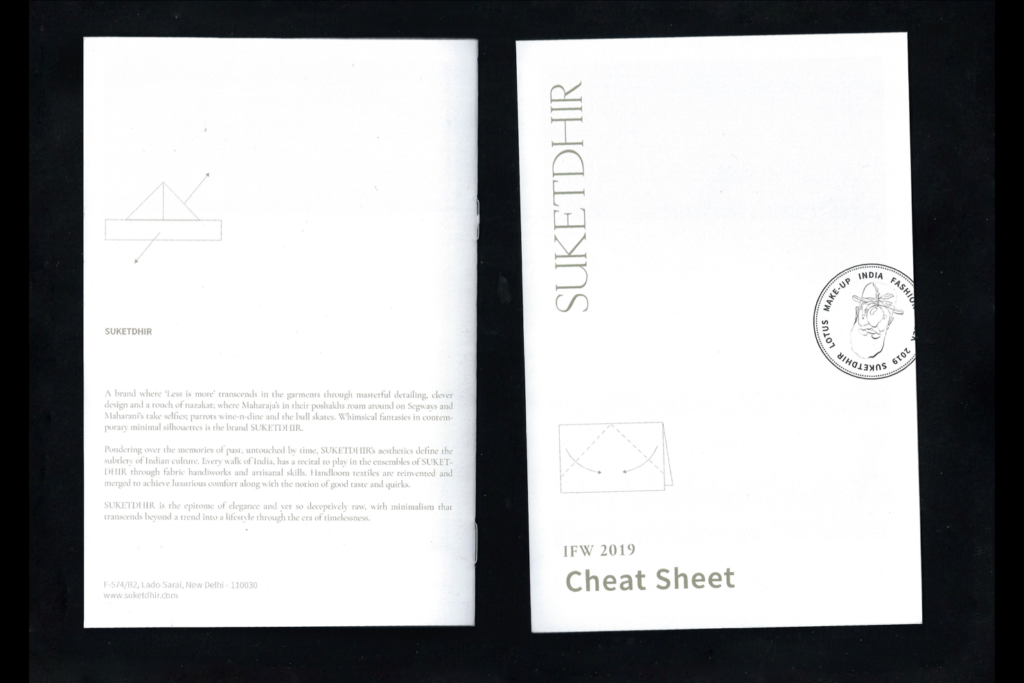
Lakme India Fashion Week, 2019
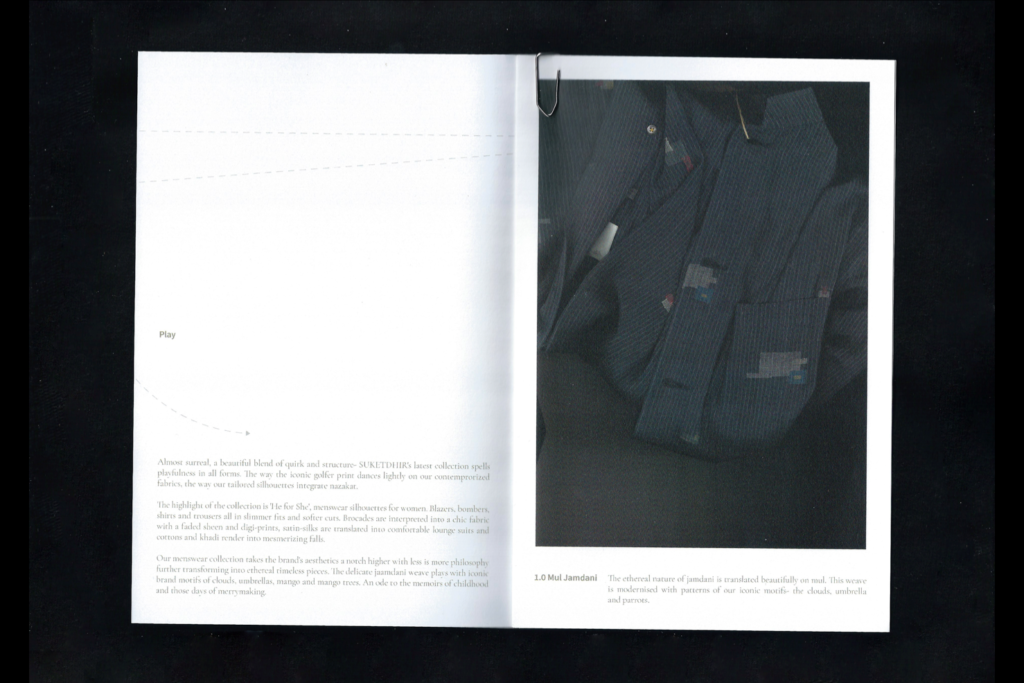
For SUKETDHIR’s collection, showcase at Lotus Fashion Week, titled ‘play,’ we explored virtual travel. We utilised the surreal 3D landscapes from our ‘He for She’ campaign and overlayed them with whimsical illustrations. Much like the collection, the absurd and playful juxtaposition of image, drawing, and type created a sense of ease and fantasy.
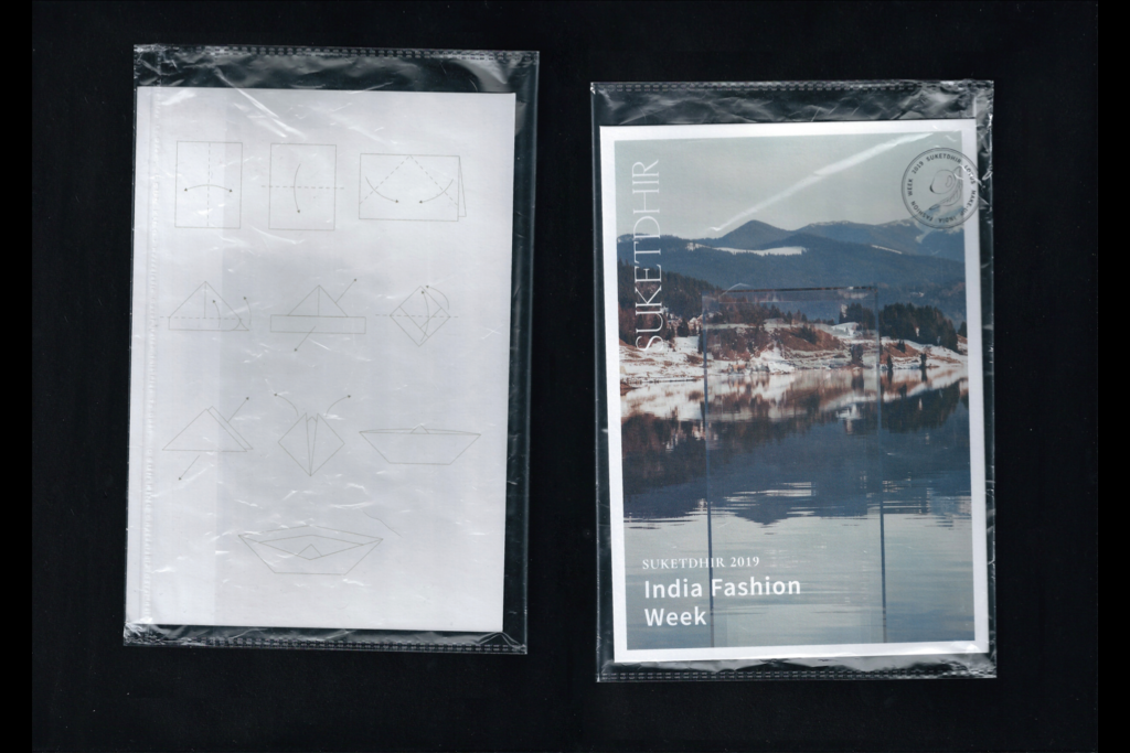
We extended the visual language to the various touchpoints of the show, which included an LED screen backdrop for the ramp, digital invites, music, and presskits. Our 15-minute backdrop featured an animated sunrise on a 3D rendered moon desert landscape. We also created micro-line drawing animations inspired by instructional drawings for folding origami shapes.
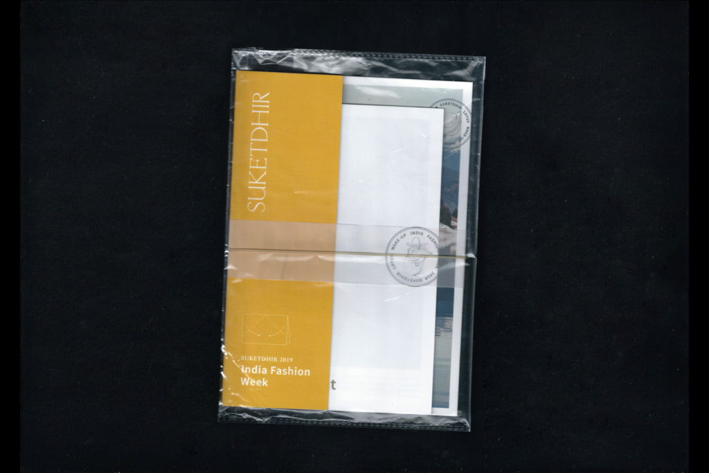
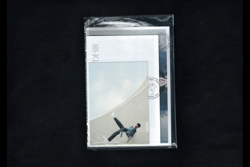
Have you ever been on vacation and found yourself with a backpack full of printed matter? Museum passes, maps, train tickets, brochures, come crawling out of your pockets. Boarding passes get repurposed as bookmarks. Information booklets become reading matter. A gathering of printed matter is what inspired the format of our designs for SUKETDHIR’s India Fashion Week debut, which consisted of a variety of print collateral in different sizes and materials, bound together by an elastic.
The 3D topographies were a precursor to SUKETDHIR’s ‘He for She’ campaign.
Stay in touch for updates on our research findings and design projects